Gap's 'lazy' new logo
The iconic American retailer has ditched its classic '80s logo for a new look, but critics aren't buying it

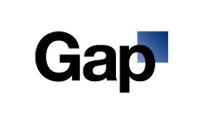
Earlier this week, Gap quietly rolled out a new logo — set in the generic typeface Helvetica — that design critics and branding experts have denounced as "lazy" and "dumb." The company responded on Facebook, saying "we're thrilled to see passionate debates unfolding" and announcing that fans would soon have the opportunity to share their own design ideas. Just what is all the fuss about, and what will it mean for a retailer that's struggled to remain relevant in recent years?
The old logo was a classic — the new one looks cheap: Like Gap's preppy basics, "the old logo didn’t call attention to itself and it was elegant without being pretentious," says Armin at Brand New. Over the years, Gap "established a cool, breezy, and sophisticated brand visual language." Now, the new logo, and its font — the ubiquitous Helvetica, which "I hate" — make "Old Navy, Gap’s low-end retail sister, look like a luxury brand by comparison."
"Don’t Mind the Gap, or the Square"
Subscribe to The Week
Escape your echo chamber. Get the facts behind the news, plus analysis from multiple perspectives.

Sign up for The Week's Free Newsletters
From our morning news briefing to a weekly Good News Newsletter, get the best of The Week delivered directly to your inbox.
From our morning news briefing to a weekly Good News Newsletter, get the best of The Week delivered directly to your inbox.
It's unprofessional and bad for business: This is a "prototypical brand-panic move" says Abe Sauer at Brand Channel. The company over-expanded and consumer spending is soft, but that doesn't mean it should reinvent itself with a "monstrosity" of a logo that "looks like it cost $17 from an old Microsoft Word clip-art gallery." The "classic" old logo was the "the one valuable element" Gap had going for it.
"Gap Rebrands Itself Into Oblivion"
No, this is what the company needed: While "I'm not sure what this new logo is all about" and if I even like it, at least the struggling retailer is trying something new, says Sarah Duxbury in the San Francisco Business Times. This "is an obvious way to revitalize a brand," and "I'm glad the company is trying something."
Sign up for Today's Best Articles in your inbox
A free daily email with the biggest news stories of the day – and the best features from TheWeek.com
Create an account with the same email registered to your subscription to unlock access.
-
 'Good riddance to the televised presidential debate'
Instant Opinion Opinion, comment and editorials of the day
By Harold Maass, The Week US Published
-
 Caitlin Clark the No. 1 pick in bullish WNBA Draft
Speed Read As expected, she went to the Indiana Fever
By Peter Weber, The Week US Published
-
 Today's political cartoons - April 16, 2024
Cartoons Tuesday's cartoons - sleepyhead, little people, and more
By The Week US Published