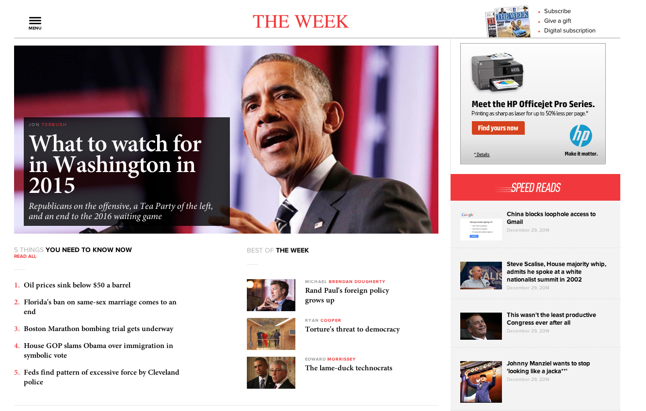
Welcome to the new TheWeek.com!


As regular visitors to the site have surely noticed by now, pretty much everything looks different than it did yesterday. But don't worry — our writers, articles, cartoons, podcasts, and more remain virtually unchanged. It's the same great product — just delivered in a much smarter way, with a few additions that we hope will improve your experience.
You can still find your favorite authors here, feature articles and opinion pieces here, Speed Reads here, editorial cartoons here, and our terrific podcasts here. Our subscriber-only magazine content is here, while our new video offering and our new "5 things you need to know now" feature can be found here and here. Pretty much anything else you might be looking for can be found by clicking the menu icon in the top left corner of the site.
So if the content is mostly the same, why did we redesign the site? A few key reasons:
The Week
Escape your echo chamber. Get the facts behind the news, plus analysis from multiple perspectives.

Sign up for The Week's Free Newsletters
From our morning news briefing to a weekly Good News Newsletter, get the best of The Week delivered directly to your inbox.
From our morning news briefing to a weekly Good News Newsletter, get the best of The Week delivered directly to your inbox.
Because you're using different devices. In 2013, we had 14.4 million visits from mobile devices. In 2014, that number skyrocketed to 43.3 million. We saw similar growth on tablets, too.
The new site is engineered to package content for any device and browser. The site is responsive — meaning it "sniffs out" what device and browser you're on, and automatically resizes and optimizes everything. The end result is that the site will look better and be much easier to use, no matter how you're viewing it.
Because we needed a design that better reflects our editorial mission. Over the last few years, we've experimented quite a lot on our website with how to best deliver on The Week Magazine's core promise — concisely providing smart, busy people with all they need to know about everything that matters — for a digital audience. About a year ago, we settled on these two sweet spots: (1) A pithy delivery of what you need to know now; and (2) A deep, intellectually rigorous understanding of the smartest arguments and ideas from all sides. We needed a site that was specifically engineered to serve these purposes.
The new site — which we designed in partnership with the dynamos at Work & Co — is meant to be a filter through which a smart, busy person can quickly and effectively make sense of a noisy and confusing world. It is meant to feel like a clear signal in the noise. It's a place where arguments from all perspectives, on all topics, can co-exist in a way that doesn't feel like internet bloodsport.
A free daily email with the biggest news stories of the day – and the best features from TheWeek.com
Because we needed to upgrade the plumbing. Our audience has exploded over the last two years — from 2.5 million unique visitors a month in 2012 to 4.5 million in 2013 to nearly 10 million in 2014. To handle an audience of this size, we needed to overhaul the infrastructure on which our site was built. So we also completely rebuilt the "back-end" part of our website that is typically invisible to users. All this new whiz-bang stuff under the hood will allow us to be much faster and more reliable in delivering great content.
Because it was time for a fresh look. We hadn't redesigned the site in years. And in many ways, our old site design wasn't as vital, bold, smart, or innovative as our content had become.
But enough from me. We'd like to hear from you. Send me an email at frumin@theweek.com and let us know what you think about the new design. Tell us what you love, what you hate, what you miss — we take your feedback very seriously. Indeed, today is just the beginning of our redesign process. In the coming weeks and months, we'll continue to add new features, enhance existing ones, test variations, scrap things that turn out to be confusing or unnecessary, and so on. So please, tell us what you think!
Ben Frumin is the former editor-in-chief of TheWeek.com.
-
 Exploring ancient forests on three continents
The Week Recommends Reconnecting with historic nature across the world
-
 The rise of the spymaster: a ‘tectonic shift’ in Ukraine’s politics
In the Spotlight President Zelenskyy’s new chief of staff, former head of military intelligence Kyrylo Budanov, is widely viewed as a potential successor
-
 How oil tankers have been weaponised
The Explainer The seizure of a Russian tanker in the Atlantic last week has drawn attention to the country’s clandestine shipping network
