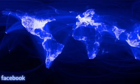
Facebook engineering intern Paul Butler wanted to create an image showing how the social network's 600 million users connect around the world. He came up with "a stunningly beautiful visual that outlines the geographical borders of Facebook friendships." (See the map below.) The high-resolution world map shows where Facebook is used most — (the Eastern United States and Europe show up as bright, glowing hives of activity) — and where it is a non-factor (China, where Facebook is banned, is a conspicuously dark void). The map also points to the vast potential of the data Facebook has at its fingertips. What are some of the key revelations gleaned from this snapshot of an increasingly connected world?
Facebook is still a Western phenomenon
"Facebook is very much a Western beast," says Simon Rogers at The Guardian. China isn't the only place that's dark on the map; Russia, South America, and Africa are are all, for the most part, in the dark.
The Week
Escape your echo chamber. Get the facts behind the news, plus analysis from multiple perspectives.
SUBSCRIBE & SAVE
Sign up for The Week's Free Newsletters
From our morning news briefing to a weekly Good News Newsletter, get the best of The Week delivered directly to your inbox.
From our morning news briefing to a weekly Good News Newsletter, get the best of The Week delivered directly to your inbox.
Latest Videos From
Other places are into social networking... just not Facebook
The "glaring holes" in Facebook activity aren't necessarily due to government restrictions, says Sara Yin at PC Magazine. Some countries just aren't that into Facebook. For instance, "Brazilians and Indians usually turn to Google's Orkut, Saudis use Maktoob, Russians use VKontakte, and the Chinese opt for QQ;com."
Africa is getting connected
It's "no surprise that looking at Africa, large areas are blank," says Reuters. But it does have corridors of connectivity, particularly one "arc stretching from Kigali, through Kampala and on to Dar es Salaam" in Tanzania. That stretch of light indicates a "technologically active and connected population," and that could be a good sign for "the development of East African Community."
Facebook's interns are not like other interns
"One expects an intern to focus on "menial office tasks," says Mike Isaac at Forbes. Butler, the creator of the map, went way beyond the call of duty. He used Facebook's vast store of data to research friend connections, then "color coded and weighted the connections on a blank canvas, accounting for longitude and latitude, and noticed [that] a rough outline of the world emerged." That's "way better than a pot of intern coffee."
The map is a validation Facebook's mission
Mark Zuckerberg has long been an evangelist for the power of online relationships. And Butler seems to have adopted the company line: "When I shared the image with others within Facebook," he writes on the site's blog, "it resonated with many people. It's not just a pretty picture, it's a reaffirmation of the impact we have in connecting people, even across oceans and borders."