How just 6 cities dominate America's economy — in one astonishing chart
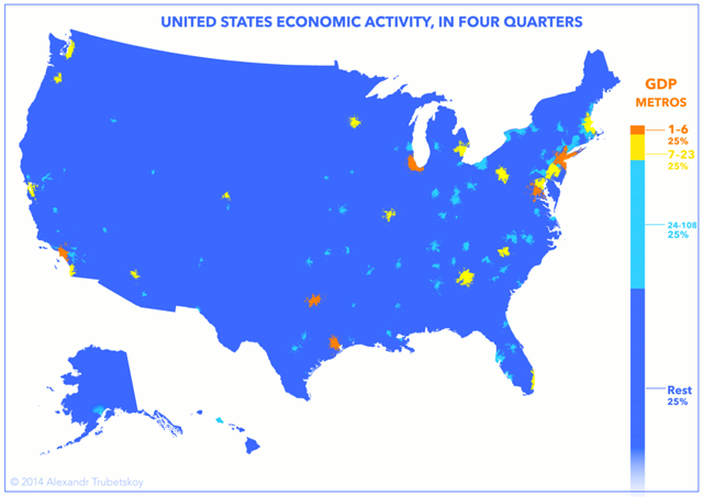
These cities make up nearly a quarter of the entire U.S. economy


It may be unsurprising to know that the location of greatest economic output is related to population density, but seeing the actual distribution is striking: the top six GDP producing cities — New York, Los Angeles, Chicago, Washington DC, Dallas, and Houston — account for nearly a quarter of the US economy. Further, America's top 23 metro areas make up nearly half of its GDP.
Alexandr Trubetskoy created the map using 2013 data from an IHS Global Insight report on U.S. Metro economies. Each color on the map represents a quarter of America's roughly $16 trillion economy.
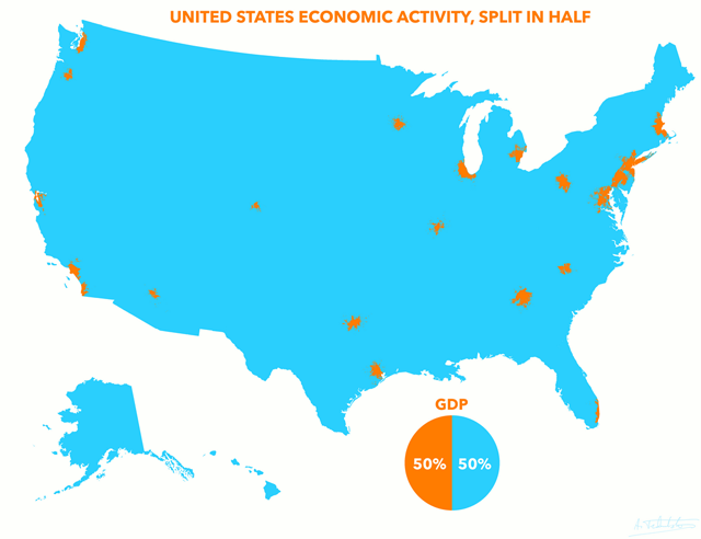
It was a revision of his original map below that was shared widely on social media. He said he changed it due to criticism against his original methodology.
The Week
Escape your echo chamber. Get the facts behind the news, plus analysis from multiple perspectives.

Sign up for The Week's Free Newsletters
From our morning news briefing to a weekly Good News Newsletter, get the best of The Week delivered directly to your inbox.
From our morning news briefing to a weekly Good News Newsletter, get the best of The Week delivered directly to your inbox.

[Alexandr Trubetskoy]
Other interesting facts from the report include:
– Out of the 100 largest economies in the world, 36 belong to U.S. metro areas.
– New York City ranks as the 13th largest economy in the world, surpassing countries like Spain, Mexico, and South Korea.
A free daily email with the biggest news stories of the day – and the best features from TheWeek.com
– New York and Los Angeles produce more than 46 of American states.
This article, by Kyle Kim, originally appeared in GlobalPost.
More from GlobalPost...
