Microsoft's new minimalist logo: Hugely disappointing?
The software giant gives revamps its brand identity for the first time in 25 years. Were a few colored squares and some lackluster type really worth the wait?

A free daily email with the biggest news stories of the day – and the best features from TheWeek.com
You are now subscribed
Your newsletter sign-up was successful
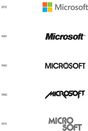
In a bid for a younger image, Microsoft on Thursday unveiled its first logo redesign in 25 years (see image below). The old one was simply the company's name in bold, italicized type with a single quirky notch in the "o." The rebrand puts the colorful-if-pedestrian Windows grid next to the Microsoft name, now set in a grayed-out version of the more modern Segoe font. The four colors in the grid "signify strength, simplicity, boldness, and other terms that sound great in a brand meeting," says Sal Cangeloso at Geek. But, problematically, "they are also the colors found in the Google logo." The change comes as the world's largest software maker is preparing to launch new or significantly updated versions of a wide range of its key products, from Windows to Windows Phone to Office. The idea is to project "a newness and freshness," Jeff Hansen, Microsoft's general manager of brand strategy, tells The Seattle Times. But is the new design any good?
What a disappointment: It's hard to believe it took Microsoft 25 years to come up with this, says Chris Matyszczyk at CNET. A corporate logo, like a lover's new hair-do, should make you coo, "You're looking younger, fitter, more startling." This minimalist look gives you "the feeling that the company had been to the hairdresser, and then merely asked for a trim." Microsoft needed to make itself look more human and modern, but this design feels "a little too cold, a little too calculated."
"Microsoft's new logo: This took 25 years?"
The Week
Escape your echo chamber. Get the facts behind the news, plus analysis from multiple perspectives.

Sign up for The Week's Free Newsletters
From our morning news briefing to a weekly Good News Newsletter, get the best of The Week delivered directly to your inbox.
From our morning news briefing to a weekly Good News Newsletter, get the best of The Week delivered directly to your inbox.
Actually, this is perfect: Microsoft could have gone for frills, says Chris Burns at Slash Gear, with shadows behind the Windows symbol, say, or a more idiosyncratic font. Instead they chose to project "simplicity and the effortless implementation," which is just what customers need as machines get smaller and more complex in the mobile era. Microsoft is saying it's ready for the post-PC world, and "we're glad to see this legend in the software business keep up with the times."
"Microsoft’s logo update tells us they’re ready for new era"
It's blah, but blah is okay: This logo is "fine," Armin Vit, a designer and editor of branding blog Brand New, tells The Seattle Times. "There's nothing offensive about it; there's nothing exciting about it." But that's an improvement on the spiky "1980s world-domination logo that was like, 'Fear Microsoft, we're going to take over your computers.'" This soft, colorful look makes Microsoft look more approachable, and, in today's market, that's a good thing. (See an in-depth analysis of the logo makeover, and how it coordinates with the company's sub-brands, at Brand New)
"New Microsoft logo gets mixed reviews"
A free daily email with the biggest news stories of the day – and the best features from TheWeek.com
Take a look at Microsoft's logo history:
