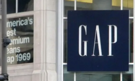
"Score one for the angry mob." After its "lazy" new logo was panned by design critics and protested on Twitter and Facebook, Gap has ditched it and meekly reverted back to its iconic blue box. "The logo passed after a brief and ignominious battle with stage IV banality," quips Vanity Fair's Juli Weiner in a eulogy. In a company statement released last night, Gap North America President Marka Hansen said "We've learned a lot in this process and know we did not go about this in the right way." What are the key lessons? Branding experts have drawn at least four conclusions:
1. Twitter can be a powerful force
"Here's one in the eye for Malcolm Gladwell," says Shane Richmond in the Telegraph. Though The New Yorker cultural analyst recently questioned Twitter's power to effect change, it's clear the social network played a key role in this branding reversal. As Alexis Madrigal at The Atlantic notes, soon after the new logo's unveiling, some wag created a parody twitter account, @GapLogo, to tweet in the injured "voice" of the maligned logo, and quickly gained "thousands of followers."
The Week
Escape your echo chamber. Get the facts behind the news, plus analysis from multiple perspectives.
SUBSCRIBE & SAVE
Sign up for The Week's Free Newsletters
From our morning news briefing to a weekly Good News Newsletter, get the best of The Week delivered directly to your inbox.
From our morning news briefing to a weekly Good News Newsletter, get the best of The Week delivered directly to your inbox.
Latest Videos From
2. Don't underestimate consumers' grasp of graphic design
"The 21st Century has really stripped the mystery from design and advertising," says Jim Edwards at BNET. "Most consumers have better software on their laptops today than professional designers had on their desktops 20 years ago." Thanks to this increased design sophistication, it's harder to pass off "lame work" like the new Gap logo.
3. Rebranding has to be more than just skin-deep
For a rebranding effort to work, the product itself, not just the logo on it, has to be altered. "The product positioning has to change first, then the logo should be the last thing," says marketing expert Craig Smith, as quoted in BBC News Magazine. Marketers often think, wrongly, that they can create a "shortcut" for a brand's evolution simply by "changing the visual identity." But that's just not how it works.
4. Inadvertently, however, Gap may have increased brand loyalty
Sure, "Gap could have stuck to its guns... it's just a logo, people!" But these days, all companies "are running scared of [their] customers," says Andy Beal in Forbes. The upside: By conceding the battle, Gap "gave the customers back their beloved logo. In turn, said customers will take a larger emotional stake in the Gap brand. It's now even more their Gap, than it was before."