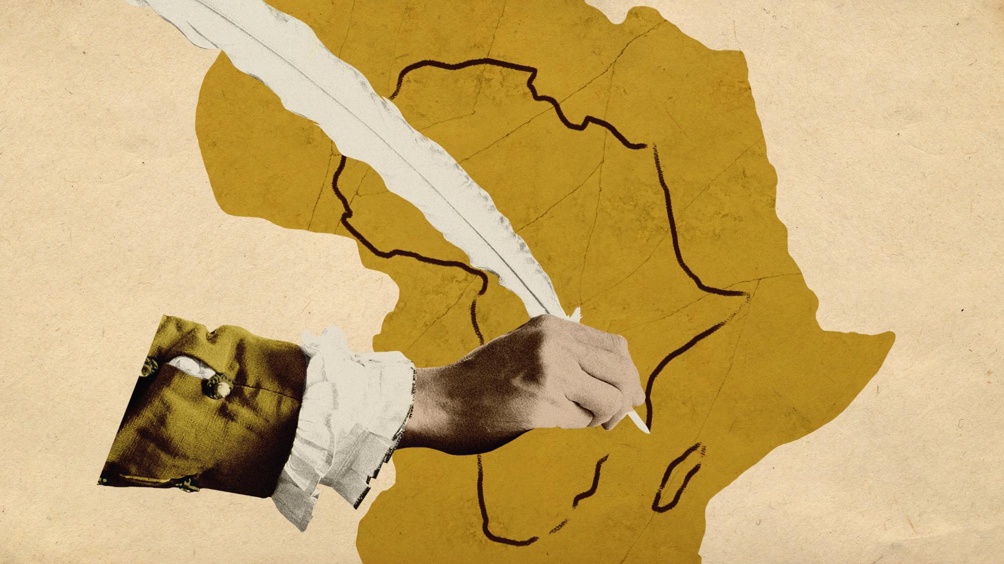
"On classroom walls from Lagos to London", the standard map of the world depicts an "inflated Britain at the centre" and a dramatically "shrunken Africa", said The Times.
But this could soon change. The African Union has thrown its weight behind a "correct the map" campaign, calling for an end to the use of the standard Mercator map in favour of one that accurately reflects the scale of the world's second-largest continent.
"It might seem to be just a map," said Selma Haddadi of the African Union Commission, "but in reality it is not."
Created in 1569 by Flemish geographer Gerardus Mercator, the world map commonly used today "did a good job" of depicting the general shape of countries, said USA Today. But when trying to map a spherical planet on to a flat piece of paper, "something's got to give". In the case of the Mercator map and its successors, "what gives is the size of places near the poles", which become distended compared to land masses nearer the Equator.
The result? A map that "disproportionately" enlarges the "rich and powerful regions of the world", said Al Jazeera.
The Mercator projection is still "widely used" by "schools and tech companies" alike, but there has been progress towards adopting a more accurate map. The World Bank says it is "phasing out" the Mercator map, while the desktop version of Google Maps switched "to a 3D globe view in 2018, although users can still switch back to the Mercator if they prefer" and it remains the default view on the mobile app. |