How the movie poster survived the digital age: A timeline
The medium has always been light on its feet, adapting with the changing times and moods of moviegoers

A free daily email with the biggest news stories of the day – and the best features from TheWeek.com
You are now subscribed
Your newsletter sign-up was successful
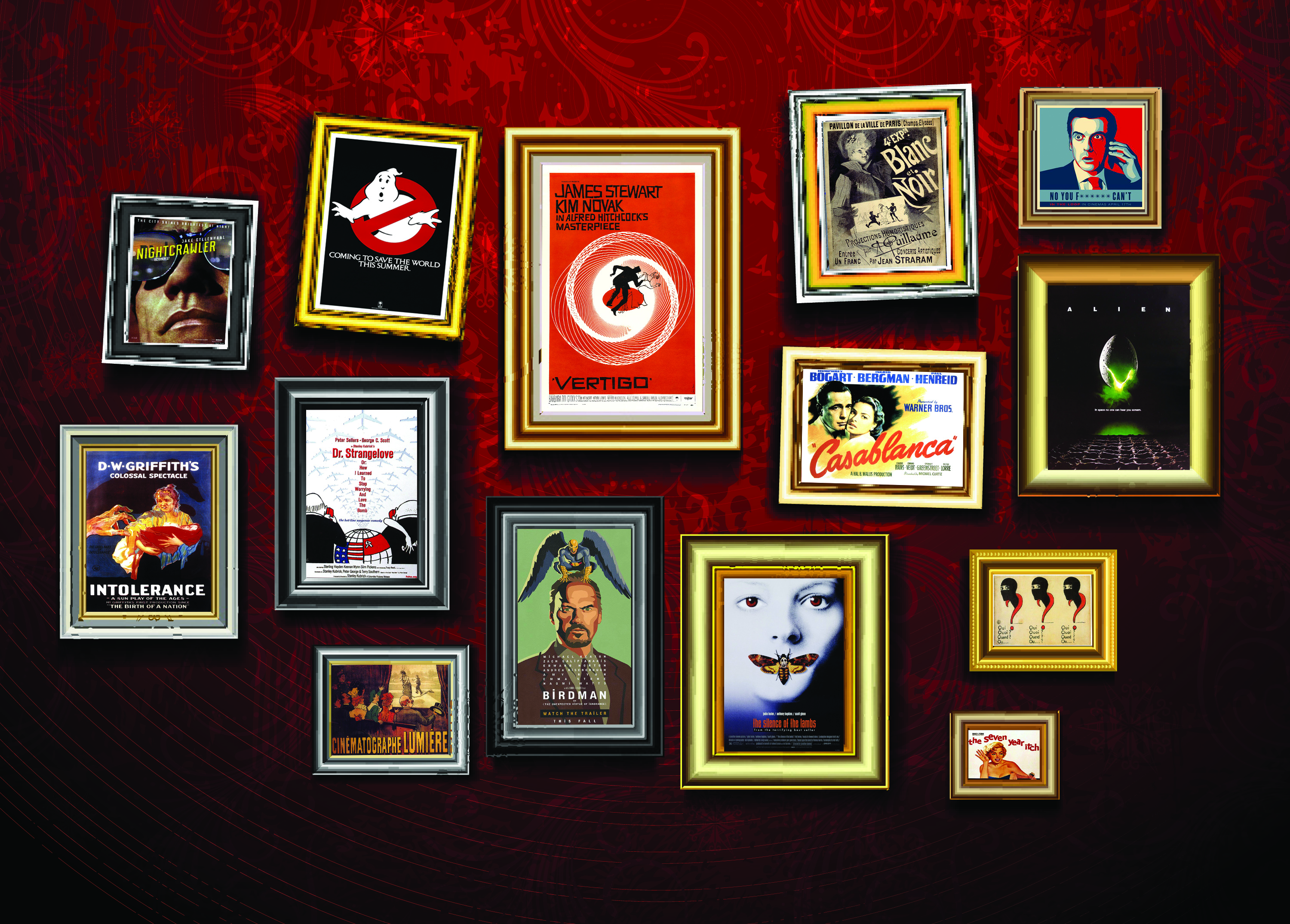
Movie posters are as old as cinema itself, but in today’s tech-savvy, binge-watching, multimedia age, the medium can seem dated, almost quaint. When we're watching the Instagram teaser of the teaser trailer on our phones, how can the movie poster compete and stay relevant? Let’s take a stroll through the art form’s strange little history and find out.
In the beginning there were placards

Once upon a time, movie advertisements were crudely drawn, block-lettered signs that announced simply the title, producer, and director. It wasn't until 1890, when French painter Jules Cheret created a lithograph promoting the short film Projections Artistiques, that what we think of the movie poster first appeared.
The Week
Escape your echo chamber. Get the facts behind the news, plus analysis from multiple perspectives.
Sign up for The Week's Free Newsletters
From our morning news briefing to a weekly Good News Newsletter, get the best of The Week delivered directly to your inbox.
From our morning news briefing to a weekly Good News Newsletter, get the best of The Week delivered directly to your inbox.
At the turn of the century, with illiteracy so widespread, movie "one-sheets" shifted to the visual, using photography, illustrations, and eventually bright colors to depict a scene straight out of the movie.
Others would promote the very act of movie-going, or the emotion it would elicit. The poster for the 1895 comedy short L’Arroseur Arrosé designed by Marcellin Auzolle, for example, shows an audience laughing as a scene from the film is projected against a screen.
Often, posters wouldn't even advertise the name of the "animated feature," as early movies were known, just the company that made it.
Few of the original posters from this era have survived. Before the 1940s, studios would release only one movie and one poster to a particular region, and the pair would travel inseparably from theater to theater. Posters were sometimes lost or in such ill-repair by the end of the run that collectors could rarely get their hands on them. Recently, when one such poster from this golden age of Hollywood was uncovered in a Pennsylvania attic, it fetched $503,000 at auction.
A free daily email with the biggest news stories of the day – and the best features from TheWeek.com
Commerce and art beautifully intertwined
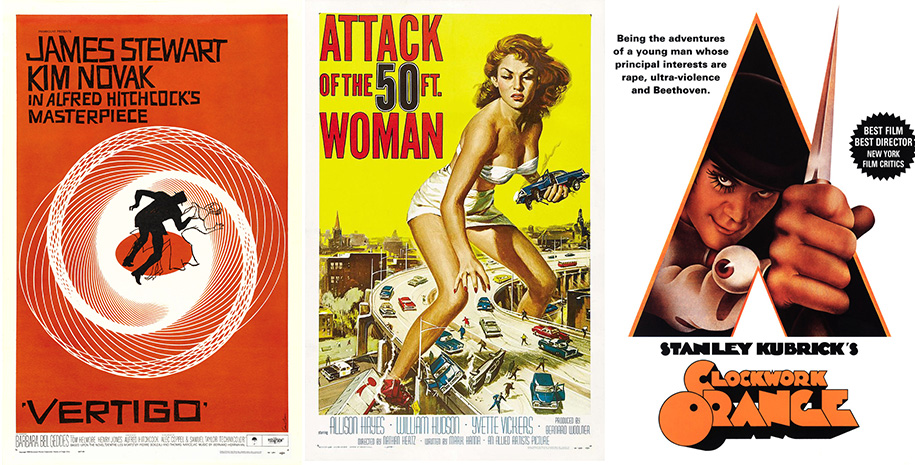
By the 1920s, studios were hiring well-known illustrators to experiment with more artistic styles and typographies. The styles typically fell into one of two categories. There were the minimalist prints often associated with Alfred Hitchcock films, where a collection of images, symbols, and fonts represent key elements from the movie.
Then there were the more interpretive posters where artists would forgo literal representations of the films for illustrations that captured the movie’s biggest moments or its emotive essence. Posters like Attack of the 50 Foot Woman and A Clockwork Orange are still considered some of the most recognizable prints of all time, better suited in a gallery than outside a theater.
The demand for such high-end work increased, and a crop of designers like Saul Bass (Vertigo, The Shining), Reynold Brown (Attack of the 50 Foot Woman), and Bill Gold (A Clockwork Orange) were able to make a living off of their movie renderings.
These earlier designs continue to influence some of today's most notable movie artwork, which eschew high-definition celebrity photography for an artistic representation. This is particularly evident in films with old-fashion themes or genres, like film noir (Out of Sight), caper (Ocean’s 11), or nostalgia (The Rocketeer). Others evoke the work of known artists, like the My Left Foot poster, which honors its subject, Christy Brown, or the British political satire In the Loop, which in its film promotions skewers Shepard Fairey's iconic drawing of President Obama. Nightcrawler's one-sheet perfectly captures the essence of a pulp novel, and reflects the Oscar-nominated film's dark twist on a Philip Marlowe-esque character.
Star power
In the early days of film, producers rarely used posters to cash in on the films' celebrity, for fear their stars would demand higher wages. But producer Carl Laemmle would be one of the first to turn that tide in 1910. To push the star power ahead of his release of The Broken Oath, he reportedly falsely publicized an actress' death.
Soon after, the typographic design and even the size of fonts began to reflect the star power of the leading lady or man of a film. By the 1930s, many actors had contracts that included clauses specifying the size and placement of their name on a poster.
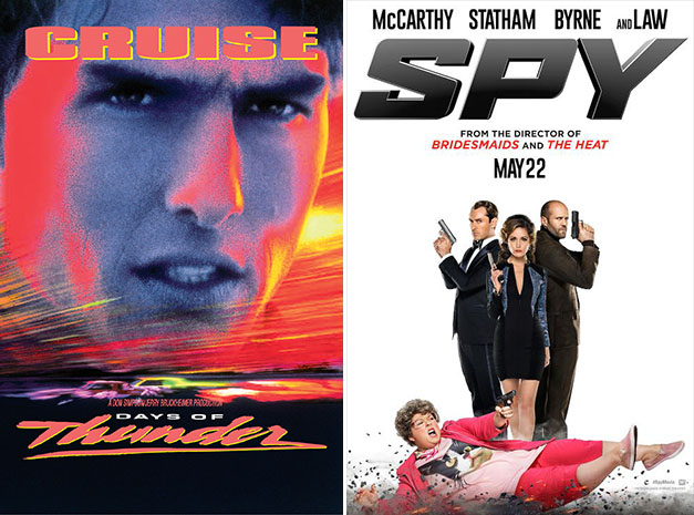
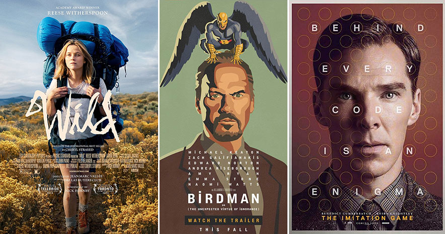
This is still evident in modern movie posters. Some have to announce only an actor’s last name to generate buzz, while others just let the stars’ comely faces sell tickets. Wild and The Imitation Game wisely let the celebrities tell you everything you might need to know about the films. Birdman, which boasts 2014's most impressive series of posters, puts an artistic spin on the face of its star, keeping in line with the meta story of a former superhero struggling to restart his career played by a former superhero who just successfully restarted his career with an Oscar nomination.
The teaser
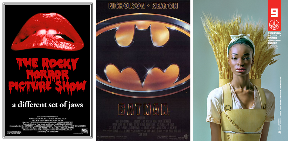
In many ways, the "teaser" or advance poster, which might feature only a symbol or the title to build excitement for a film's release, can be traced back to Steven Spielberg and the birth of the modern blockbuster era of the 1970s.
Who can forget the Jaws teaser or the Jurassic Park logo? Who can think of Rocky Horror without picturing those seductive, grotesque red lips, or Ghostbusters without the cartoon phantom? The 1989 version of Batman didn’t need much more than the classic bat symbol to encourage moviegoers to flock to cinemas, and some 20 years later, The Dark Knight nailed the teaser poster once more by introducing the Joker. And the Star Wars: Episode I — Phantom Menace poster, depicting a young Anakin standing in the shadow of Darth Vader's form, successfully sent fans into a tizzy even if the movie proved to be a disappointment.
These days many studios use posters to create viral campaigns on social media. These are typically a series of striking, suggestive posters that speak to a movie, actor, or filmmaker's already established fan base. The Hunger Games franchise did this with its most recent installment, MockingJay: Part 1, releasing powerful, propaganda-style posters ahead of its 2014 release.
The tagline is another effective means of alluring viewers. The Social Network used its one-sheet to skewer Facebook founder Mark Zuckerberg, and fame itself, in perfect quips. More recently, Gone Girl's tagline — "You don’t know what you’ve got til it's…" — captures the tone for the entire movie: a little playful, a lot dark. The tagline for last year's Gravity —"Don’t let go" — rivaled what some might consider the greatest slogan of all time — "In space, no one can hear you scream" — from the original Alien poster.
Modern posters: All about the buzz
With moviegoing at an all-time low, posters are often designed expressly to create buzz and sell tickets. Take a gander, if you dare, at the purposefully salacious collection of Nymphomaniac posters, each showing one of the movie's stars in the throes of ecstasy. The Fault in Our Stars created a mini-controversy upon the release of its poster early last year, which boasted the tagline "One sick love story." Suddenly the film's young stars found themselves defending, of all things, a poster (but the buzz probably didn't hurt). The Interview, not surprisingly, embraced the controversy surrounding its inception and release — "brought to you by the Western capitalist pigs..." — long before the film was being canceled, protested, criticized, un-canceled, and panned.
Movie posters may be relics of a bygone era of filmmaking, but studios have learned to shift the visual strategy to a faster, more viral product. By using a range of styles and artists and releasing a series of images that build on one another, the artwork can create its own headlines, sometimes to the detriment of a movie that can't live up to the hype.
Julia Hawes is a freelance writer and communications professional living in Durham, North Carolina. A graduate of Vassar College and Northwestern University, she has worked as a journalist in Chicago, Boston, and The Hague covering the arts, social justice issues, and travel, three of her favorite things.
