Radiant orchid: How Pantone picks its color of the year
Pinkish-purple is the new black

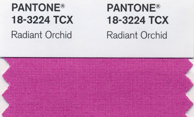
On Thursday Pantone, a company that forecasts color trends and sells color swatches, announced the "it" color of 2014: "Pantone 18 3224 Radiant Orchid," otherwise known as pinkish-purple.
In a press release, Pantone sung the color's praises. The "surprisingly versatile" color complements many shades of green, as well as turquoise, teal, and light yellows, says the company.
It also symbolizes originality. "An invitation to innovation, Radiant Orchid encourages expanded creativity and originality, which is increasingly valued in today’s society," says Leatrice Eiseman, executive director of the Pantone Color Institute.
The Week
Escape your echo chamber. Get the facts behind the news, plus analysis from multiple perspectives.

Sign up for The Week's Free Newsletters
From our morning news briefing to a weekly Good News Newsletter, get the best of The Week delivered directly to your inbox.
From our morning news briefing to a weekly Good News Newsletter, get the best of The Week delivered directly to your inbox.
For the uninitiated, Pantone famously created a widely used color-matching system that standardizes more than 2,000 color variations, giving companies around the world a common vocabulary for discussing colors for their products.
Each year, Pantone holds a "secret meeting" at a European capital in a purposefully drab, colorless room, Slate reported in a 2012 article on the process. Over two days, representatives from different countries' color-standards groups present and debate their ideas and collectively narrow it down from 2,000-plus to one. Last year they landed on Emerald. The year before it was Tangerine Tango.
Pantone and its experts consider a variety of factors, says The Wall Street Journal.
Pantone...each year polls graphic, industrial, fashion, and other designers around the world, as well as manufacturers and retailers, asking what colors they plan to use in coming seasons. A color committee made up of Pantone executives and clients makes a pick based on the surveys, sales of color swatches, and its experts' opinions. [The Wall Street Journal]
In other words, it's not just a group of fabulous taste makers deciding what color products companies should make. It's fashion designers whose creations have already graced the runways, and manufacturers that are already producing pinkish-purple kitchen appliances.
A free daily email with the biggest news stories of the day – and the best features from TheWeek.com
Their inspiration comes from the "entertainment industry and films that are in production, traveling art collections, hot new artists, popular travel destinations, and other socio-economic conditions," says the press release. This latter factor may have been especially key last year, when Pantone chose emerald green, a color people associate with "growth, renewal, and prosperity," according to the company.
Since the products are already on production lines, it's hard to say how much influence Pantone has on color trends. "But given the company's insider access — which amounts to a cheat sheet from style leaders — its choice tends to show insight," says the Journal. There's even a radiant orchid Keurig machine already in the works, the paper points out.
Carmel Lobello is the business editor at TheWeek.com. Previously, she was an editor at DeathandTaxesMag.com.
