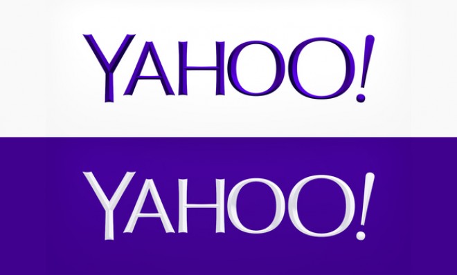
Yahoo's redesigned logo: What the internet is saying
It's still really purple

Late last night, Yahoo formally unveiled a new logo after about a month of teasing out a redesign. The "30 days of change campaign," said chief marketing officer Kathy Savitt, was Yahoo's way of "having some fun while honoring the legacy of our present logo."
It's the first logo redesign in 18 years for the purple-clad web giant. "We knew we wanted a logo that reflected Yahoo — whimsical, yet sophisticated. Modern and fresh, with a nod to our history," Mayer wrote on her shiny new billion-dollar Tumblr. "Having a human touch, personal. Proud."
Mayer went on to note that Yahoo's designers didn't want any straight lines in the logo, since straight lines "don't exist in the human form and are extremely rare in nature." The team also considered using all lowercase letters, but in the end decided that uppercase was more easily readable, especially from a mobile device.
The Week
Escape your echo chamber. Get the facts behind the news, plus analysis from multiple perspectives.

Sign up for The Week's Free Newsletters
From our morning news briefing to a weekly Good News Newsletter, get the best of The Week delivered directly to your inbox.
From our morning news briefing to a weekly Good News Newsletter, get the best of The Week delivered directly to your inbox.
"The end result eschews many of the design trends to come out of Silicon Valley in recent years," writes John Brownlee at Fast Co. Design. "Where the zeitgeist is to go flat, Yahoo has gone beveled, almost three-dimensional."
Initial reaction has, at least so far, been less than kind:
I don't think it's that bad, especially with the white-on-purple background. It's certainly not a GAP-level atrocity, and probably a level or two below say, Aol's latest refresh. Is it functional? Sure. Brilliant? Meh. Still distinctively Yahoo, weird exclamation point and all? Surely.
And hey! Tech logos aren't exactly the kinds of things designers daydream about when they're reclining in a cushy Eames lounger; 98 percent of the logos out there are atrocities that we've quickly grown accustomed to, anyway. (Google, eBay, and Facebook's obsession with blue immediately come to mind. Sony's fat, austere lettering still wins as my all-time personal fave.)
A free daily email with the biggest news stories of the day – and the best features from TheWeek.com
TIME's Harry McCracken hits the Yahoo logo redesign on the nose here:
So let's all take a deep breath. Marissa Mayer's Yahoo is still one of the two biggest sites on the internet. And it's still really, really purple.
