Facebook Home: Pretty, but... pretty basic
Here's what reviewers are saying about the social network's sparkly new Android layer

Plenty of people were shocked when the mythical Facebook Phone turned out to be, well, not a phone. Yes, there was the HTC First, but the spotlight during Facebook's recent press conference really belonged to a previously unseen hybrid between app and UI that transforms some Androids into people-powered Facebook machines. The smooth, picture-heavy interface was christened simply, "Home." Critics have been able to spend some time with Home, and the reviews are in. What you need to know before it's released April 12:
Joanna Stern at ABC News likes what she sees, at least at first glance:
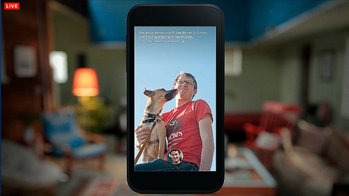
Facebook didn't just go to Ikea to decorate, it hired a top of the line interior designer: The usual Android lock or homescreen is replaced with a very visual and polished interface. The screen cycles through a series of your friends' statuses, each of which is displayed on top of an image (either a Cover Photo or a shared photo) with a Ken Burns-like panning effect. You can manually cycle through the updates by swiping, double tapping to "Like" a status or photo or hold down on it to see the full image. [ABC News]

But she also admits that putting "friends" photos front and center might not be such a good thing:
The Week
Escape your echo chamber. Get the facts behind the news, plus analysis from multiple perspectives.

Sign up for The Week's Free Newsletters
From our morning news briefing to a weekly Good News Newsletter, get the best of The Week delivered directly to your inbox.
From our morning news briefing to a weekly Good News Newsletter, get the best of The Week delivered directly to your inbox.
[The] design can quickly turn ugly. Sure, over the past week I've had numerous photos of cute dogs, delicious baked goods and perfectly refined selfies grace the front of the HTC First. But I've also had lewd photos of a body builder, children I really don't know, and bottles of beer stream across it. Unlike Facebook's marketing page, my Facebook Newsfeed isn't a constant stream of beautiful landscape shots, and many of my Facebook friends aren't, dare I say it, real friends. [ABC News]
Dieter Bohn at The Verge is a fan of the update stream:
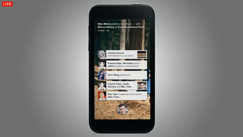
One thing I really do like with Home is how it handles notifications. Instead of scurrying them away in the Notification drawer, they're presented front and center in a set of stacked cards in the center of your homescreen a la iOS.
Each card presents a small preview of the notification and you can tap on it to open the relevant app or swipe it away to the left or right. You can also long-press to stack all of them up and then dismiss them as a group. Finally, you can swipe them down to temporarily hide them if you want to get a better look at your Cover Feed. [The Verge]

Brad Molen at Engadget says messaging — or "Chat Heads" — is one of Home's "greatest strengths":
Whenever you receive a new message, you'll see a bubble pop up with that person's profile picture inside, with the number of unread messages in red and the first few words of text proudly displayed in a tiny box off to the side. These bubbles, which will appear regardless of which app you're currently in, are called "Chat Heads." You can move the chat head around to different places on either side of the screen (never in the middle, likely because it would become too much of an interference with your other activities), or drag it down to the bottom to get it out of the way. If you're following multiple conversation threads, you'll notice that the chat head turns into a stack. [Engadget]

Harry McCracken at TIME thinks Chat Heads is "nicely done," but had a problem with the feature…
The one thing that sometimes flummoxed me: Each Chat Head is a tiny version of the person's profile picture, cropped to fit inside a circle. I couldn't always tell whom a Chat Head represented from this visual clue alone. [TIME]
While Home definitely has potential, says McCracken, for now the people-centric software layer is pretty basic:
A free daily email with the biggest news stories of the day – and the best features from TheWeek.com
Really, if what you want is a people-centric phone, you should consider one that uses Windows Phone 8. Microsoft's phone operating system is a much more fleshed-out exploration of the vision Zuckerberg articulated at the Home launch event. [TIME]
Walt Mossberg at All Things D had plenty of nice things to say, and concludes that Home will probably find its intended audience:
Facebook Home is a very clever and very well-done product that will delight Facebook fans. If you aren't in that category, or prefer the standard Android user interface, it won't be right for you. [All Things D]
David Pogue at The New York Times was left questioning what exactly Home is supposed to accomplish, summing the whole experience up nicely:
Facebook, man. [New York Times]