It's official: No one likes Hillary Clinton's campaign logo

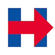
(Image credit: Facebook.com/Hillary Clinton)
No one knows quite what to make of it. As Sol Sender, the designer of President Obama's famous "O" logo, tells The New York Times, "It's not a particularly galvanizing type symbol. It doesn’t say a whole lot." And what it does say may be the wrong message, as this New Yorker cartoon points out:
The Week
Escape your echo chamber. Get the facts behind the news, plus analysis from multiple perspectives.
SUBSCRIBE & SAVE

Sign up for The Week's Free Newsletters
Join more than 350,000 subscribers and keep yourself informed with a selection of The Week’s most interesting, enlightening and entertaining stories - plus daily puzzles.
Join more than 350,000 subscribers and keep yourself informed with a selection of The Week’s most interesting, enlightening and entertaining stories - plus daily puzzles.
Explore More


