How Washington, D.C., ended up with the same official font as fast-food chain Shake Shack


A free daily email with the biggest news stories of the day – and the best features from TheWeek.com
You are now subscribed
Your newsletter sign-up was successful
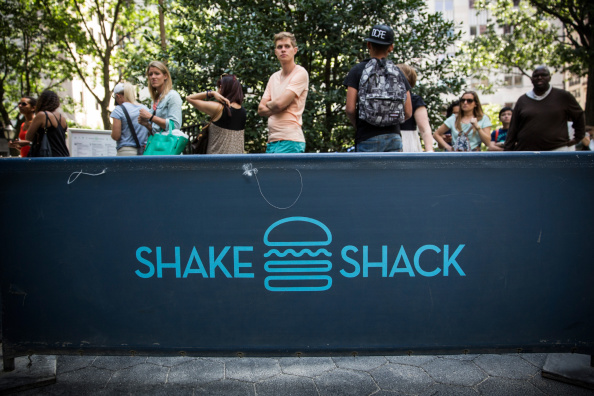
It's called "Neutra," and you see it every time you turn on HBO's Girls, order a SmokeShack from Shake Shack, or go to a Washington Nationals game. And now the hipster-chic, thin, mid-century font is officially the typeface of Washington, D.C.
Iframe Code
The Week
Escape your echo chamber. Get the facts behind the news, plus analysis from multiple perspectives.

Sign up for The Week's Free Newsletters
From our morning news briefing to a weekly Good News Newsletter, get the best of The Week delivered directly to your inbox.
From our morning news briefing to a weekly Good News Newsletter, get the best of The Week delivered directly to your inbox.
"Whatever we're promoting, whether it's summer camp or a public health test, we want to make sure that it looks and feels like a government product," Michael Czin, director of communications for the mayor's office, told Wired.
So how exactly did our nation's capital decide on a font? Let Wired explain:
[Designer Andy] Cruz credits the font's "certain stylistic but non-descript feel." "I think it has that comforting authority to it," he says.[Designer Paula] Scher doesn't regard the font as neutral, saying that it harkens back to a specific moment in time — the midcentury — which makes it an odd choice for a city government. "It's a retro font," she says. What does it have to do with progress? Then again — this is Washington D.C. [Wired]
A free daily email with the biggest news stories of the day – and the best features from TheWeek.com
Jeva Lange was the executive editor at TheWeek.com. She formerly served as The Week's deputy editor and culture critic. She is also a contributor to Screen Slate, and her writing has appeared in The New York Daily News, The Awl, Vice, and Gothamist, among other publications. Jeva lives in New York City. Follow her on Twitter.
