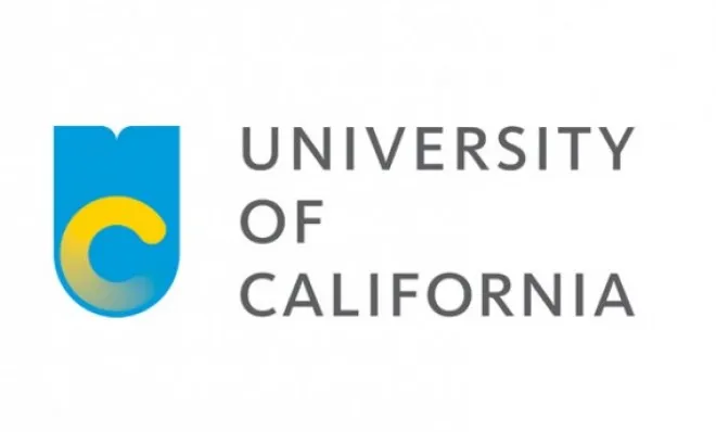
This week, the University of California revealed a modern new logo that the school system loves because it renders well on mobile devices. The alumni, however, despise the new logo — a yellow, half-formed C set within a tall, light-blue U — likening it to a banana, a flushing toilet, and even, ironically, a picture that hasn't finished rendering. California Lt. Gov. Gavin Newsom, who also disparages the change, took to Twitter to retweet alumni complaints, and has called on UC to reinstate its old logo. Whether the university budges remains to be seen, but in the case of other logo makeovers than have triggered a backlash, the offenders have sometimes capitulated. Here, a look at eight logo controversies:
University of California
Taken aback by the alumni's rejection of the logo, the University of California tried to appease commenters on its Facebook page by sharing information about the redesign strategy — noting, for instance, that the former logo doesn't render well on websites — as well as the history of the UC logo. But people are still fuming, including Newsom, who says the redesign "fails to respect the history and the prestige of the University of California." Although UC will continue using its traditional logo on diplomas and official letters, the logo for the mobile age — which comes in a variety of color combinations — will be the centerpiece of its website.
The Week
Escape your echo chamber. Get the facts behind the news, plus analysis from multiple perspectives.
The software giant revamped its logo in August, the first such tweak in 25 years. Apparently, though, PC users were still not ready for change. The rebrand simplified the colorful Windows grid and set the wordmark in a grayed-out version of the relatively sedate Segoe font, upsetting those who'd grown attached to the quirky notch in the "o" that characterized the former bold, italicized wordmark. Many decried the new look as too simple and far from cutting-edge: It gives you "the feeling that the company had been to the hairdresser, and then merely asked for a trim," said Chris Matyszczyk at CNET. It just "doesn't tell me enough about Microsoft’s vision of Microsoft," said Harry McCracken at TIME.
Starbucks
How big has Starbucks gotten? Big enough, apparently, to strip its logo of any words at all, letting the company's signature mermaid communicate the brand alone. While some called the controversial January 2011 move "gutsy" — pointing out that it aligns Starbucks with other megabrands like Apple and Nike that forgo words in their logos — others called it a boneheaded change that just begged for criticism from loyal customers. Yet, nearly two years later, Starbucks is still employing the wordless logo, and recently reported a record 2012 net revenue of $13.3 billion.
Sign up for Today's Best Articles in your inbox
A free daily email with the biggest news stories of the day – and the best features from TheWeek.com
Gap
In what may be the biggest flop in logo-redesign history, clothing retailer Gap unveiled a new logo in October 2010 featuring the word "Gap" set in ungainly Helvetica type with a small blue square cantilevered off the "p" — doing away with the classic logo, a dark blue square out of which the word "Gap," set in an elegant serif font, is reversed. Brand Channel called the change "a prototypical brand panic move," indicating that the struggling khaki purveyor thought it could boost sales by messing provocatively with its iconic logo. Others called the revision flat-out "lazy" and "dumb." Just four days after revealing the change, Gap reverted to its old logo — a move some cynics figured had been part of the P.R. plan all along.
In September 2010, then-Democratic National Committee chief Tim Kaine unveiled the party's stripped-down new logo, which detractor J.P. Freire at The Washington Examiner suggested was just more "Obama iconography" because the circle surrounding the "D" echoed the 2008 Obama campaign's branding, whether deliberately or not. The logo, which replaced the traditional red, white, and blue donkey, also came with a new Obama-esque slogan: "Change that matters." Unfortunately, the 2010 midterm elections brought change that mattered more to Republicans.
Seattle's Best Coffee
Known for its "smooth-roasted" coffee, Seattle's Best (which is owned by Starbucks) unveiled a logo revision in May 2010 that met with a rather bumpy reaction. Dumping its traditional-looking original logo, the company went modern and minimalist for a look that Seattle Weekly said is "what you'd get if you combined Target with the Red Cross, which is the opposite of appetizing." Frustratingly, said Peter Morris at Brand New, this logo doesn't tell me whether this company sells coffee or home-cleaning products.
Tropicana
Don't mess with people's orange juice. A few weeks after launching a new carton design for Tropicana Pure Premium orange juice in January 2011 — a simple affair featuring a glass of juice — parent company Pepsi announced that it was scrapping the whole thing, and reverting to the former packaging, distinguished by an image of an actual orange pierced with a straw. The redesign had been savaged for sacrificing the brand equity of this signature piece of fruit. In a further twist, Pepsi soon abandoned cartons altogether, introducing a clear, plastic carafe instead.
While not technically a logo revision — every Olympics gets a new, unique logo — the design for this summer's London Olympics was greeted with horror. Tony Pierce at LAist thought it resembled Lisa Simpson in a rather compromising position. The backlash reached global proportions with Iran's Olympic Committee calling the design "racist," arguing that it read as the word "Zion." The designers behind the image said the dissonance was intentional: "The mark itself came from an energy grid we drew of lines that moved around, contained within a rectangle, which we stopped at one particular moment." Nope, still don't get it.
Frances is a senior editor at TheWeek.com, managing the website on the early morning shift and editing stories on everything from politics to entertainment to science and tech. She's a graduate of Yale and the University of Missouri journalism school, and has previously worked at TIME and Real Simple. You can follow her on Twitter and on Tumblr.