No, this chart does not portend a financial apocalypse
Learning from the past is smart. But these supposed historical parallels are just dumb.

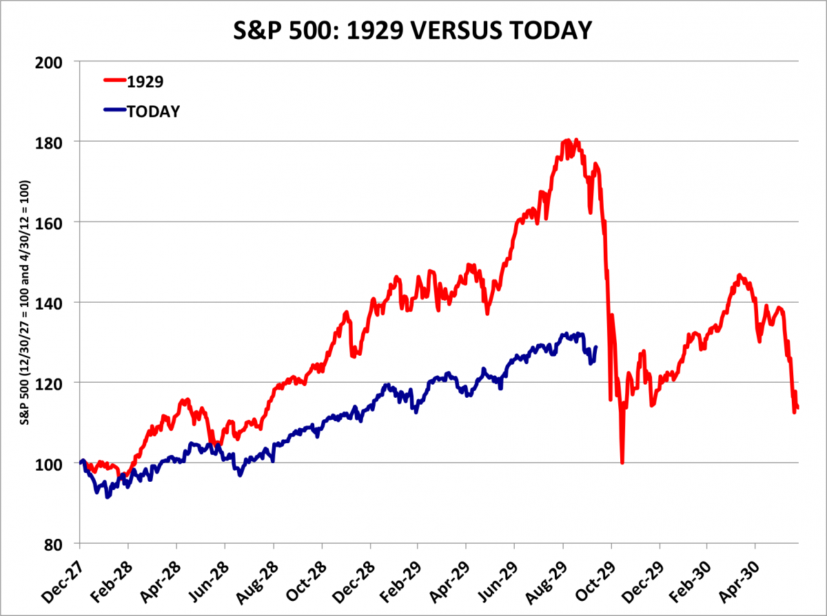
For the last three months, a scary-looking chart has been making the rounds on Wall Street. Its thesis? That the stock market in 2014 is shaping up like that of 1929, the year of a catastrophic crash:
Yet as Matthew Boesler and Andy Kiersz of Business Insider argue, when the markets are expressed in percentage terms, this apparent pattern completely falls apart:
The Week
Escape your echo chamber. Get the facts behind the news, plus analysis from multiple perspectives.

Sign up for The Week's Free Newsletters
From our morning news briefing to a weekly Good News Newsletter, get the best of The Week delivered directly to your inbox.
From our morning news briefing to a weekly Good News Newsletter, get the best of The Week delivered directly to your inbox.

[Business Insider]
This demonstrates an important principle. A the late economist Ronald Coase argued, if you torture the data for long enough, eventually you can make it confess.
And what would this correlation really tell us, even if it held up in percentage terms? That the stock market rose in the lead-up to 1929, and in the lead-up to 2014. But it wouldn't tell us anything about why the stock market crashed in 1929 that we could possibly apply to 2014.
Markets are large groups of people interacting, all with different and changing priorities, different ideas about how the world works, and ever-changing moods and sentiments. This process is fundamentally chaotic and unpredictable. Nobody actually knows when or where the next financial crash will arrive. It is possible to make a coherent argument that it will arrive sooner rather than later based on a number of factors — an over-exuberant technology sector, fear over the tapering of the Federal Reserve’s quantitative easing program, currency turmoil in emerging markets, and rising levels of leverage on Wall Street, among other things.
A free daily email with the biggest news stories of the day – and the best features from TheWeek.com
But only time will tell whether such arguments are correct or not. A fudged correlation between the stock market in 1929 and 2014 adds nothing at all to the conversation.
John Aziz is the economics and business correspondent at TheWeek.com. He is also an associate editor at Pieria.co.uk. Previously his work has appeared on Business Insider, Zero Hedge, and Noahpinion.