The letter O: Made complex by 17th century calligraphy
In the hands of master calligraphers, the humble O can shed its simplicity, its symmetry, and even its bounded borders

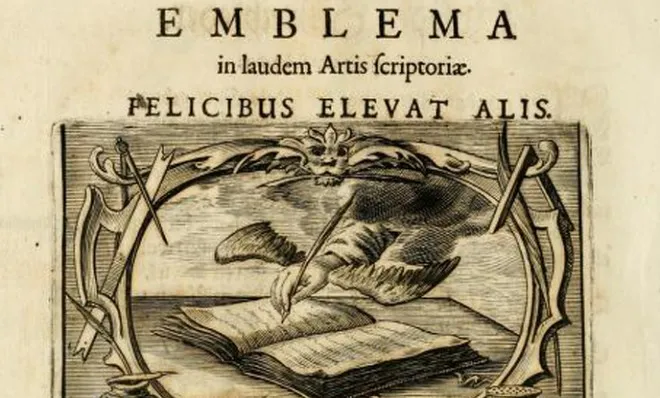
Of all our letter forms, the O is arguably the simplest. One stroke moving in one direction. A circle, perhaps an oval, grounded and elemental. A pair of rounded lips, an eye, an egg, the earth. But in the hands of master calligraphers, the humble O can shed its simplicity, its symmetry, and even its bounded borders to perform feats of 'O'ness that defy all expectation. Here are 12 Os from a 17th century German book, The Proper Art of Writing: a compilation of all sorts of capital or initial letters of German, Latin and Italian fonts from different masters of the noble art of writing, each one more complex and beautiful than the one before it.
1. CLASSIC

The Week
Escape your echo chamber. Get the facts behind the news, plus analysis from multiple perspectives.

Sign up for The Week's Free Newsletters
Join more than 350,000 subscribers and keep yourself informed with a selection of The Week’s most interesting, enlightening and entertaining stories - plus daily puzzles.
Join more than 350,000 subscribers and keep yourself informed with a selection of The Week’s most interesting, enlightening and entertaining stories - plus daily puzzles.