Twitter makes it easy to shine a light on the icky corners of humanity. All the Internet's nastiness is just a few clicks away, should you choose to come face-to-face with it.
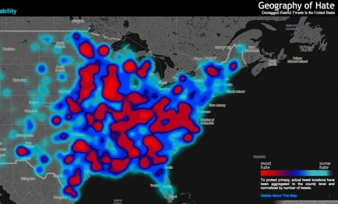
The latest example is a mapping project by students at Humboldt State University called the Geography of Hate, which uses Google Maps to illustrate the hate-filled language spit out into the Twitter ether.
According to the data, homophobes and racists aren't exclusive to certain regions of the United States. Rather, words like "n---er," "ch--k," and "f-g" are used pretty much anywhere people are. (Except Utah, apparently, which we'll get to in a bit.)
The Week
Escape your echo chamber. Get the facts behind the news, plus analysis from multiple perspectives.
SUBSCRIBE & SAVE
Sign up for The Week's Free Newsletters
From our morning news briefing to a weekly Good News Newsletter, get the best of The Week delivered directly to your inbox.
From our morning news briefing to a weekly Good News Newsletter, get the best of The Week delivered directly to your inbox.
Latest Videos FromThe Week
Unlike other studies, the project didn't use an algorithm to sift through tweets. Instead, a team of students manually combed through some 150,000 geo-tagged missives to pinpoint where the words were coming from. Because of the project's human component, slang like "no homo" and its ilk — the casualness of which can be just as grievous, it should be noted — were dismissed. Only what was determined to be explicit hate speech was included in the heat map.
According to the Guardian, the data was then normalized, "meaning that the scale accounts for the total Twitter traffic in each county so that the final result is something that shows the frequency of hateful words on Twitter." Results were only recorded where Twitter is used, which may explain Utah's apparent good behavior — a separate 2010 study ranked the state last in terms of Twitter usage.
All of which raises the question: Is Twitter a reliable gauge of American public opinion? Perhaps not. A recent study from Pew Research found that public sentiment on Twitter "often differs a great deal from the public opinion as measured in surveys." The social media platform's reach is actually quite modest: Just 13 percent of American adults say they tweet or use Twitter for news.
What's interesting about this mapping project, though, is that the user data remains anonymous. Although the choice was made mainly for privacy concerns, it inadvertently serves a larger purpose, making it clear that "racism" is more than an endemic problem that can be solved with feel-good finger-wagging. Those big, red globs mean that we as a country have a long way to go, Brad Paisley's assurances be damned.
Explore the project in depth over here. (Via Gawker)