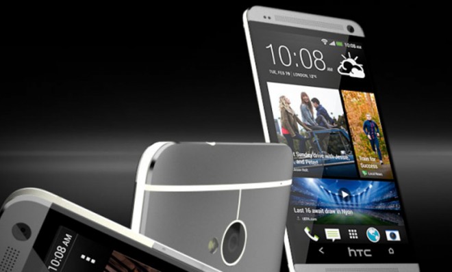
The HTC One: Bold, beautiful, and far from perfect
Can a gorgeous new piece of Android hardware keep pace with Samsung's Galaxy and Apple's iPhone?

Tech bloggers "ooh'd!" and "ahh'd!" when the curtains parted to reveal the HTC One last month — an aluminum-clad, heavyweight Android smartphone charged with the unenviable task of stealing marketshare from Apple's iPhone and Samsung's Galaxy S line. And now that reviewers have spent some time with the new gadget, let's review what they've identified as the pros and cons:
Chris Finnamore at Expert Reviews says the design is a thing of beauty:
The One is a gorgeous phone, and we think it wipes the floor with the Sony Xperia Z. The combination of metal rear, bevelled metal edges and edge-to-edge screen are class itself, and make the Xperia Z feel square and tacky, despite its glass rear. The HTC One's curved back also makes it comfortable to hold — a minor downside is that it's tricky to type when it’s lying flat on a desk. [Expert Reviews]
And Finnamore says the screen is topnotch:
The Week
Escape your echo chamber. Get the facts behind the news, plus analysis from multiple perspectives.

Sign up for The Week's Free Newsletters
From our morning news briefing to a weekly Good News Newsletter, get the best of The Week delivered directly to your inbox.
From our morning news briefing to a weekly Good News Newsletter, get the best of The Week delivered directly to your inbox.
We were also seriously impressed with the screen. It's a 4.7-in model with a Full HD 1,920x1,080 resolution, leading to a huge pixel density figure of 468 [pixels per inch]. When compared side-by-side with the Xperia Z's display, we preferred the HTC One's screen, thanks to its superb contrast. It has incredibly deep blacks (for an LCD at least), and our test photos showed rich, vibrant colors and plenty of shadow detail. [Expert Views]
Meanwhile, Gareth Beavis at TechRadar thinks its weight and heft are just right :
When handling the device, you'll also note the sheer weight of the thing — as in, there is very little. […] It's different also to the iPhone 5, which was too light in the minds of many that moved from older models, and the HTC One marries balanced weight with enough heft to make it offer that premium feel. [TechRadar]
But David Pierce at The Verge argues that HTC's non-stock version of Android — which the company calls "Sense" — is "bloated and overwrought":
I immediately missed the clean and cohesive look of Android 4.2 on the Nexus 4, plus the features the One eschews by only offering Android 4.1.2 — but it does soften the Sense blow. HTC's skin's biggest fault was always that it slowed down an otherwise speedy operating system, and that's not really the case here. Aesthetically, there are still some frustrating changes, like the cartoonish icons in Settings and a few ugly app icons, but throughout the UI HTC has exercised some much-needed restraint. [The Verge]
And Pierce says the Flipboard-like news reader, BlinkFeed, can be annoying:
It's a handy tool, sure, but I really don't like having it there every time I unlock my phone — it's like having someone shove a newspaper in your face every time you open your eyes, and left me overwhelmed by the idea of turning my phone on. [The Verge]
At least the camera is innovative, says Matt Warman at The Telegraph:
A free daily email with the biggest news stories of the day – and the best features from TheWeek.com
The so-called Zoe Camera… effectively takes a burst of shots (so you might form a zoetrope, should you wish), around the time you know you want a picture, rather than from when you press the button. The effect is to give you more options and to let you compose a single shot from the best bits of what is actually in several images. [The Telegraph]
And overall, Warman says, the phone is at least as good as Samsung's Galaxy SIII:
It's not the hardware innovation that sticks in my minds after the little time I had with the HTC One; a lovely, 4.7-inch screen, good sound, great camera feel like the bare necessities today. It's innovation in software, led by the Blinkfeed, that will decide whether the One is good enough. I'd certainly give it a go, but for now my general, tentative impression would be that it’s at least as good as the S3, rather than the leapfrog HTC needs to regain its former glory. [The Telegraph]
But ultimately, says The Verge's Pierce, the phone leaves something to be desired:
I really, really like the HTC One. I'm a sucker for beautiful hardware, and this device is one of the best-designed smartphones I've ever used. […] In my quest to find the perfect Android phone, I'm still left wanting. I want the One's hardware, but I want the Nexus 4's software and promise of timely updates — I've said for a year that HTC should offer stock Android phones, and I'm still convinced the company could save itself with the One plus pure Android. [The Verge]