Google Reader's 'infuriating' redesign
After the search king unveils a sparse new look for its popular RSS tool, formerly loyal users are readying their pitchforks

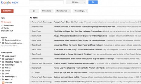
A redesign of Google's popular RSS tool, Google Reader, is "infuriating" users. RSS, which stands for "Really simple syndication," allows readers to automatically receive the latest posts from their favorite blogs and websites all in one place: In this case, a website called Google Reader. But Google has opted to dramatically revamp Reader's look and its drastically changed sharing function now employs Google+ tools in an effort to integrate Reader with Google's new social network. Is the redesign really so bad?
Yep. It's awful: Total "disaster," says former Google project manager Brian Shih at his blog. Clearly, Google wants Reader to look more like Gmail and Documents. "But it's as if whoever made the update did so without ever actually using the product to, you know, read something." The giant header leaves little room for content. Then there's the "unbelievably stark" white-and-gray color palette that makes reading a "desolate experience." They've "crippled [Reader] under the guise of improvements."
"Reader redesign: Terrible decision, or worst decision?"
The Week
Escape your echo chamber. Get the facts behind the news, plus analysis from multiple perspectives.

Sign up for The Week's Free Newsletters
From our morning news briefing to a weekly Good News Newsletter, get the best of The Week delivered directly to your inbox.
From our morning news briefing to a weekly Good News Newsletter, get the best of The Week delivered directly to your inbox.
Google clearly sacrificed Reader for Google+: The new sharing function basically ruins Reader, says Rebecca J. Rosen at The Atlantic. Poorly designed and non-intuitive Google+ tools have completely replaced the ease and fun of the former sharing methods. It seems "that Google was willing to kill off Reader's sharing communities to save Google+." That's understandable from a business perspective, but it won't win Google many fans among Reader devotees.
"Google Reader backlash: A fuss over nothing?"
C'mon. We'll get used to it: The new Reader isn't so bad, says Keith Wagstaff at TIME. Its new look is "crisp, clear and easy on the eyes, a godsend for someone like me who scrolls through the Reader like the guys scanning code in The Matrix." Sure, it feels like Google is forcing us to use Google+, but that's a smart move on Google's part. "All in all, this is probably a win for Google, even if it takes Reader users a while to get used to it."
"New Google Reader: Improvement or total disaster?"
A free daily email with the biggest news stories of the day – and the best features from TheWeek.com
