The most important chart in economic policy right now
It proves America's hiring binge still has a long, long way to go


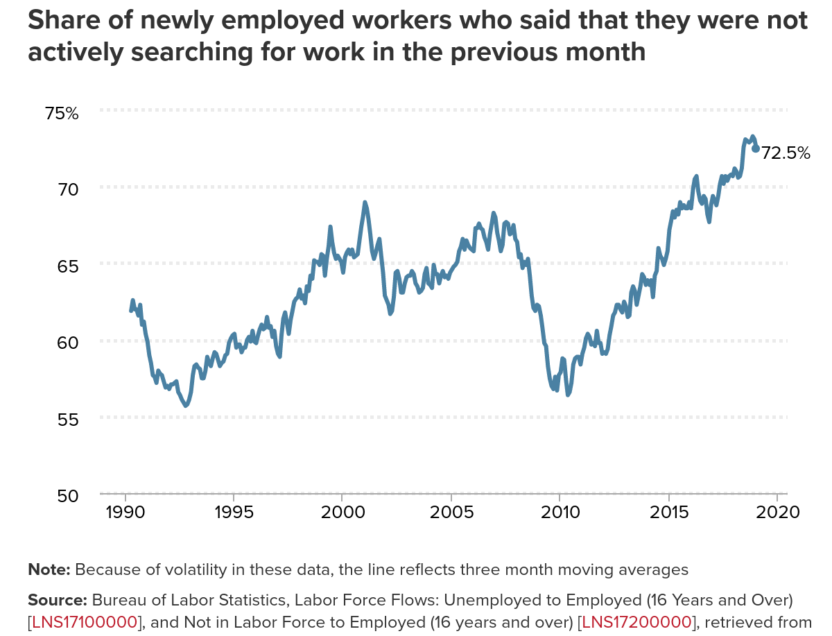
Below is the most important graph in economic policy right now. Courtesy of the Economic Policy Institute, it's the portion of newly hired people each month who weren't even looking for work the month before. And as you can see, it's higher than at any point since at least 1990.

"No one else is really paying attention to it," Elise Gould, an economist at EPI who often discusses the chart, told The Week. "I think it's really interesting because it's just another way in which the economy isn't as strong as some of the topline numbers would suggest."
Right now, the headline unemployment rate is the lowest in decades. You might think we're about to run out of workers to hire. If so, the Federal Reserve should be hiking interest rates faster to ward off inflation. "I'm not sure how the Fed can justify its new highly dovish stance with these kinds of jobs numbers," Politico's Ben White wrote after Friday's jobs report. It also suggests the federal government should lay off deficit spending, lest it overheat the economy — precisely the criticism many prominent liberals hurled at the GOP's big tax cut package.
The Week
Escape your echo chamber. Get the facts behind the news, plus analysis from multiple perspectives.

Sign up for The Week's Free Newsletters
From our morning news briefing to a weekly Good News Newsletter, get the best of The Week delivered directly to your inbox.
From our morning news briefing to a weekly Good News Newsletter, get the best of The Week delivered directly to your inbox.
But the unemployment rate is, well, a rate. It has a numerator (how many people don't have jobs) and a denominator (how many potential workers are out there). Government statistics call the denominator the labor force. But if we underestimate the numerator, we'll underestimate the unemployment rate, and wind up concluding — as White and others do — that we're a lot closer to maxing out the economy's capacity than we really are.
And how, you might ask, do we measure the labor force? Government statistics define it as any adult who has a job, or who has looked for one in the last month.
That gets us back to the graph.
It tells you how many Americans out there aren't even registering as "in the labor force," but who nonetheless want jobs and can get them when the economy really gets going. And it's a ton. The job market is hoovering up these Americans at the fastest pace in at least three decades. We haven't just sort of underestimated the numerator, we've badly underestimated it.
A free daily email with the biggest news stories of the day – and the best features from TheWeek.com
And as a result, we've left millions of Americans in the lurch.
As the pool of potential workers dries up, employers start having to compete with each other for labor. They like to complain about labor shortages when that happens. But it actually pressures them to raise wages, and to treat workers better in all sorts of ways: from scheduling, to harassment policies, to paid leave, to workplace safety, and more. It also forces employers to hire from groups they might have biases against — people without college degrees, or disabled workers, or nonwhite Americans, or people with felony convictions.
If policymakers underestimate how many potential workers there are and cool off the economy too soon, then all of those benefits never kick in. A huge portion of jobs will always be poorly paid or come with lousy conditions. And yes, people will sometimes pick some mix of unemployment or government assistance instead.
But if employers feel enough pressure, all those Americans will be pulled off the sidelines.
Perversely, mainstream economists spent years assuming everyone on the sidelines wanted to be there and weren't coming back. After 2008, the Federal Reserve repeatedly assumed unemployment was about to stop falling, and the Congressional Budget Office kept assuming the central bank was about to crank up interest rates. And both things kept not happening.
Granted, the Fed has been steadily hiking interest rates in small increments since December 2015. And when it announced a pause last week, people were weirded out. But looking at that graph up top, what's really weird is that the Fed was raising interest rates at all.
Attacking deficit spending is equally bizarre, especially for Democrats. Yes, a huge portion of the GOP tax cut went to the rich, which is basically a waste. But some of it went to ordinary consumers, thus boosting demand for jobs. The GOP quietly green-lit more federal spending for 2018, which helped as well. The new Democratic House, and Democratic presidential candidates for 2020, should be promising more of the same, not less.
One last thing about that graph: look back further than the Great Recession. When does it peak? At the tops of the last two business cycles, in 2001 and 2007. When the economy's boomed, we've pulled more people off the sidelines.
Which raises the question: When did we ever get to them all?
Editor's note: A previous version of this article misdefined the numerator in the unemployment rate and the source of a quote. It has been corrected. We regret the error.
Jeff Spross was the economics and business correspondent at TheWeek.com. He was previously a reporter at ThinkProgress.

