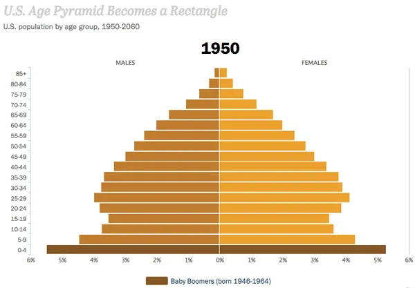
Watch America's looming age imbalance unfold in 4 seconds
The Pew Research Center has an amazing new report about America's shifting demographics that shows how the country is getting older, less white, and more liberal. The entire report is worth your time, and it includes some beautiful animated visualizations to put the demographic changes in context.
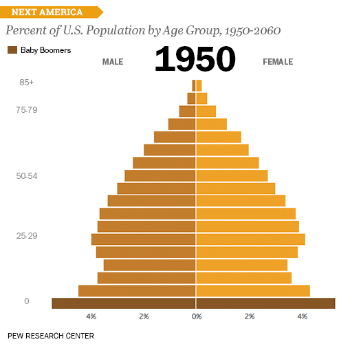
For instance, one such visualization shows the dreaded age distribution phenomenon that's projected to occur over the coming decades as Baby Boomers become the oldest generation. When charted with the oldest folks up top and the youngest people at the bottom, societies tend to have age distributions shaped like pyramids, like so:

The Week
Escape your echo chamber. Get the facts behind the news, plus analysis from multiple perspectives.

Sign up for The Week's Free Newsletters
From our morning news briefing to a weekly Good News Newsletter, get the best of The Week delivered directly to your inbox.
From our morning news briefing to a weekly Good News Newsletter, get the best of The Week delivered directly to your inbox.