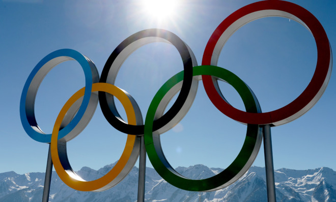
What do the Olympic rings mean?
The Olympic rings are everywhere this month, from the Athletes' Village in Sochi to cereal boxes in the U.S. Here's a look at what they're supposed to symbolize.

A free daily email with the biggest news stories of the day – and the best features from TheWeek.com
You are now subscribed
Your newsletter sign-up was successful

In 1894, Pierre de Frédy, Baron de Coubertin — a French aristocrat and intellectual who had previously attempted to incorporate more physical education in schools — convened a congress in Paris with the goal of reviving the ancient Olympic Games (an idea Coubertin first introduced at a USFSA meeting in 1889). The congress agreed on proposals for a modern Olympics, and the International Olympic Committee was soon formalized and given the task of planning the 1896 Athens Games.
After the 1912 Stockholm Games — the first Games featuring athletes from all five inhabited parts of the world — a design of five interlocked rings, drawn and colored by hand, appeared at the top of a letter Coubertin sent to a colleague. Coubertin used his ring design as the emblem of the IOC's 20th anniversary celebration in 1914. A year later, it became the official Olympic symbol.
The rings were to be used on flags and signage at the 1916 Games, but those games were cancelled because of the ongoing World War. The rings made a belated debut at the 1920 Games in Antwerp, Belgium.
The Week
Escape your echo chamber. Get the facts behind the news, plus analysis from multiple perspectives.

Sign up for The Week's Free Newsletters
From our morning news briefing to a weekly Good News Newsletter, get the best of The Week delivered directly to your inbox.
From our morning news briefing to a weekly Good News Newsletter, get the best of The Week delivered directly to your inbox.
Coubertin explained his design in 1931: "A white background, with five interlaced rings in the centre: Blue, yellow, black, green and red...is symbolic; it represents the five inhabited continents of the world, united by Olympism, while the six colors are those that appear on all the national flags of the world at the present time." Coubertin used a loose interpretation of "continent" that included Africa, the Americas, Asia, Europe, and Oceania. He never said nor wrote that any specific ring represents a specific continent.
Because the rings were originally designed as a logo for the IOC's 20th anniversary and only later became a symbol of the Olympics, it's also probable, according to historian David Young, that Coubertin originally thought of the rings as symbols of the five Games already successfully staged.
Ancient Rings?
Popular myth (and an academic article) has it that the rings were inspired by a similar, ancient design found on a stone at Delphi, Greece. This "ancient" design, however, is really just a modern prop.
A free daily email with the biggest news stories of the day – and the best features from TheWeek.com
For the 1936 Summer Games in Berlin, Carl Diem, president of the organizing committee, wanted to relay the Olympic Flame from its lighting point in Olympia to the Olympic stadium in Berlin. Diem, it seems, had a flair for theatrics, and included in the relay a stop at Delphi's ancient stadium for a faux-ancient Greek torchbearers' ceremony complete with a faux-ancient, three-foot-tall stone altar with the modern ring design chiseled into its sides.
After the ceremony, the torch runners went on their way, but no one ever removed the stone from the stadium. Two decades later, British researchers visiting Delphi noticed the ring design on the stone. They concluded that the stone was an ancient altar, and thought the ring design had been used in ancient Greece and now formed "a link between ancient and modern Olympics."
The real story behind the altar was later revealed and "Carl Diem's Stone" was moved from the stadium and placed near the ticketed entrance to the historic site.
The inspiration for Coubertin's design seems to be a little more modern. Four years before he convened his Olympic congress, he had become president of the French sports-governing body, the Union des Sociétés Françaises de Sports Athlétiques (USFSA). The Union was formed from the merging of two smaller sporting bodies, and to symbolize this, a logo of two interlocking rings — one red and one blue, on a white background — was created and displayed on the uniforms of USFSA athletes.
"It seems quite obvious," says historian Robert Barney in a 1992 Olympic Revue article, "that Coubertin's affiliation with the USFSA led him to think in terms of interlocked rings or circles when he applied his mind towards conceiving a logo ... indeed, a ring-logo that would symbolize his Olympic Movement's success up to that point in time.... Circles, after all, connote wholeness, the interlocking of them, continuity."
Lord of the Rings
The IOC takes their rings very seriously, and the symbol is subject to very strict usage rules and graphic standards, including:
*The area covered by the Olympic symbol (the rings) contained in an Olympic emblem (e.g. the 2008 Games emblem) can't exceed 1/3 of the total area of the emblem.
*The Olympic symbol contained in an Olympic emblem has to appear in its entirety (no skimping on rings!) and can't be altered in any way.
*The rings can be reproduced in a solid version (for single color reproduction in blue, yellow, black, green, red, white, gray, gold, silver, or bronze) or an interlocking version (interlaced from left to right; and reproduced in any of the aforementioned colors or full color, in which case the blue, black, and red rings are on top and the yellow and green are on the bottom).
*For reproduction on dark backgrounds, the rings must be a monochromatic yellow, white, gray, gold, silver, or bronze; full color on a dark background is not allowed.
This article originally appeared in 2010.
More from Mental Floss...