These charts show just how bad Ebola has gotten in West Africa
It's not a pretty picture


The worst-ever outbreak of the deadly virus Ebola has likely killed upwards of 5,000 people, mainly in Guinea, Liberia, and Sierra Leone. Isolated cases have now begun to appear in Europe and the U.S., too.
In other words, it's bad. Here's a look back at how the situation initially progressed.
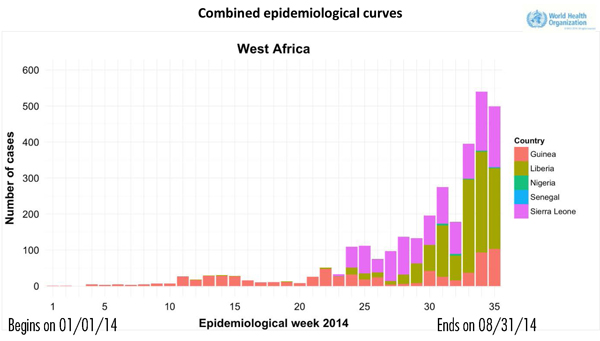
The chart below shows all the reported cases from January through Aug. 31, broken down by week. What started out as a problem only in Guinea passed into neighboring regions pretty quickly. The chart shows us how the number of Ebola virus cases have exploded in subsequent weeks.
The Week
Escape your echo chamber. Get the facts behind the news, plus analysis from multiple perspectives.

Sign up for The Week's Free Newsletters
From our morning news briefing to a weekly Good News Newsletter, get the best of The Week delivered directly to your inbox.
From our morning news briefing to a weekly Good News Newsletter, get the best of The Week delivered directly to your inbox.
As of mid-October, 4,555 people had died from Ebola out of a total of 9,216 cases registered in seven countries, according to the World Health Organization. (Those numbers have since risen.)

In Guinea, more than 100 cases were newly reported in the first week of September. Sierra Leone saw more than 150 cases reported each week for two weeks earlier this month. Liberia remains the most affected, with more than 200 cases reported per week.
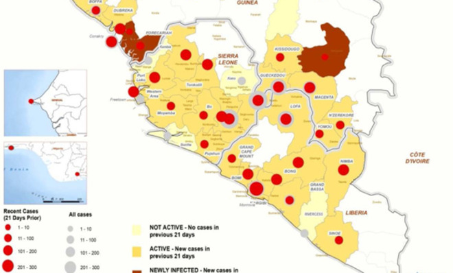
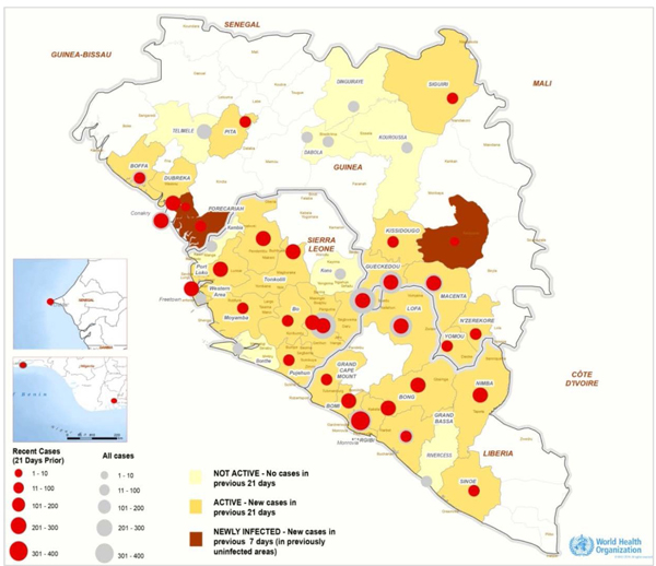
The map below shows the location of reported Ebola cases in West Africa. A few areas have become "not active," meaning they haven't had any cases over the last 21 days. Most, though, remain "active" areas where new cases continue to be reported. More worryingly, the map shows new districts that have been affected in September. A crucial piece of this chart is the red circles, which show cases that have been reported in the last 21 days of August.

Most cases occur in nine out of the 42 regions of Guinea, Liberia, and Sierra Leone. For the first time since the epidemic began, however, 55.3 percent of cases have now been reported outside of these nine regions.
A free daily email with the biggest news stories of the day – and the best features from TheWeek.com
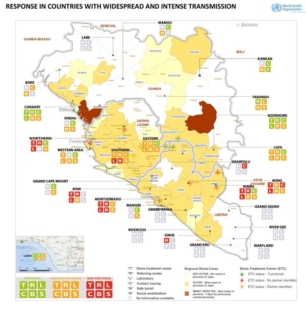
This next map, also created by WHO, in collaboration with Doctors Without Borders (MSF), shows how West African nations are attempting to respond to the Ebola crisis. It covers:
- Ebola Treatment Centers: Where patients can receive treatment for the disease
- Referring Centers: Where patients are diagnosed and their case is reported
- Laboratories: To assist referring centers and Ebola treatment centers as needed. "Increased laboratory capacity is essential for proper screening and triage of patients," according to WHO.
- Contact tracing: A preventative measure that catalogs all people the patient may have had contact with to stop further spread of the virus. WHO considers this an area of concern as more cases and deaths are reported.
- Safe burial: Facilities that ensure safe burial of persons who have died from Ebola. WHO is particularly concerned with the safety of community burials and mass cremation.

According to WHO, there is a serious shortage of beds in Ebola treatment centers in Guinea, Liberia, and Sierra Leone. In total, Guinea has 130 beds, Liberia has 314, and Sierra Leone has 130, numbers that don't even come close to covering the number of reported cases. Based on current needs, WHO says they need another 980 Ebola treatment beds in the region, 760 of these in Monrovia, Liberia.
"Although plans are in place to build such facilities," reported WHO, "there are challenges related to site selection as well as a critical shortage of clinical teams available to manage these facilities."
Well, 3,000 American troops should help with that.
This article, by Simran Khosla, originally appeared on GlobalPost.
More from GlobalPost...
