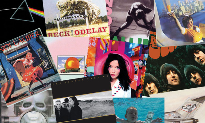
The stories behind 22 classic album covers
Featuring a Hungarian dog, a swimming baby, and a stroll through Greenwich Village

1. Nevermind (1991)
Nirvana
Design by Robert Fisher and Kirk Weddle
The Week
Escape your echo chamber. Get the facts behind the news, plus analysis from multiple perspectives.

Sign up for The Week's Free Newsletters
From our morning news briefing to a weekly Good News Newsletter, get the best of The Week delivered directly to your inbox.
From our morning news briefing to a weekly Good News Newsletter, get the best of The Week delivered directly to your inbox.
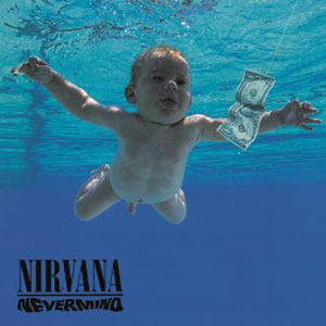
Spencer Elden's first time swimming was a memorable one.
At four months old, Elden was one of several babies on hand at a Pasadena public pool to audition for Nirvana's album cover.
"I showed Kurt the baby picture," designer Robert Fisher said, "and he liked it but felt it needed something more. We threw all kinds of ideas around and Kurt jokingly suggested a fish hook. We spent the day thinking of all the things you could put on a fish hook. Although Kurt never gave me a rationale for the design, I must assume that the naked baby symbolized his own innocence, the water an alien environment, and the hook and dollar bill his creative life entering into the corporate world of rock music."
As for Elden, he says, "Most bands around today can't even get near to what Nirvana did on that album, and I'll always be happy to be a part of it."
A free daily email with the biggest news stories of the day – and the best features from TheWeek.com
2. The Velvet Underground & Nico, aka the "Banana Album"
The Velvet Underground & Nico
Design by Andy Warhol
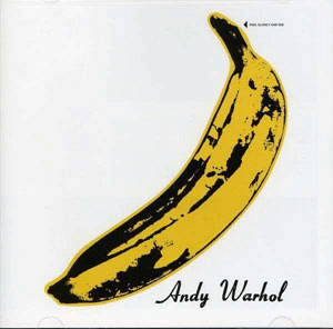
With apologies to Carmen Miranda and Chiquita, the world's most famous banana is the ripe, peelable print on the cover of the Velvets' debut.
Designed by pop artist Andy Warhol, the image was a silkscreen made from simple black-and-white acetate film. In case the genitalia-esque shape wasn't provocative enough, Warhol added the invitation: "Peel slowly and see." Beneath the sticker a pink, flesh-colored fruit was revealed.
"The banana actually made it into an erotic art show," said Velvet Underground singer Lou Reed.
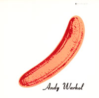
But for Verve Records, the banana was a production nightmare. "Someone had to sit there with piles of albums, peel off the yellow banana skin stickers and place them over the pink fruit by hand," said Warhol's artistic director Ronnie Cutrone.
By 1968, the peelable banana was dropped. Originals now fetch up to $500 apiece. The fruity image has since thrived on everything from art prints to T-shirts to handbags.
(More from Mental Floss: 10 things you might not have known about Truman Capote)
3. Who's Next (1971)
The Who
Design by John Kosh and Ethan Russell
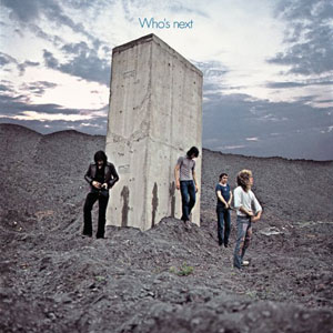
Sometimes you can't go when you need to. That's what photographer Ethan Russell found out when he shot the cover for Who's Next.
Turning away from a concrete piling, located in an old English mining town called Easington Colliery, the band appear to have just left their urine signatures on the stone. But Russell recalled discreetly, "Most of the members were unable to go, so rainwater was tipped from an empty film canister to achieve the desired effect.
In 2003, VH1 named Who's Next the second greatest album cover of all time.
4. Skull and Roses (1971)
Grateful Dead
Design by Stanley Mouse
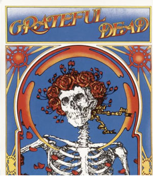
Talk about vintage. The skull and roses that became the Grateful Dead's enduring trademark has its roots in a 19th-century woodcut made to illustrate a poem from the 11th century.
"I found the original image in the stacks of the San Francisco Public Library," said painter Stanley "Mouse" Miller. "It was created by an artist named Edmund Sullivan to illustrate a poem in The Rubaiyat of Omar Khayyam. The block print underscores the verse, 'The Flower that once has blown forever dies.'"
"I thought, 'Here's something that might work for the Grateful Dead.'"
Mouse made a name in the '60s as a hot-rod painting sensation (remember Rat Fink?), modifying dragsters and choppers.
His work with the Dead continued through many classic albums, including Workingman's Deadand American Beauty.
5. Houses of the Holy (1973)
Led Zeppelin
Design by Hipgnosis
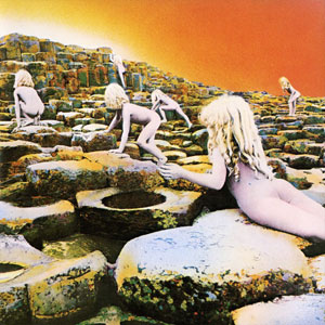
It was no fun being one of Robert Plant's love children.
"Freezing rain, bad food, and turpentine — a nightmare." That's a male model recalling his experience as one of the naked innocents on the cover of Zep's fifth album.
At 4 a.m., every morning for a week, three adults and two children were sprayed silver from head to toe, then driven to Giant's Causeway in Northern Ireland to crawl on the rocks toward a sunrise that never rose.
Faced with deadlines and a dwindling budget, design company Hipgnosis took the weather into their own hands, painting a honey-peach dawn and hand-tinting bare bottoms to a rosy glow.
Worried that those bare bottoms might cause controversy, Atlantic Records tied the finished album with a Japanese-style band of paper called an "obi." Printed with the title in Celtic style letters, it was the world's first rock 'n' roll Huggie.
6. Dark Side of the Moon (1973)
Pink Floyd
Design by Hipgnosis and George Hardie

For a band who once sang, "We don't need no education," it's ironic that the cover image of their best-selling album is based on a school textbook illustration.
The Floyd was "bored with the photos" from their earlier LP covers and wanted something "smarter."
"The prism represented both the diversity and cleanliness of the sound of the music," designer Storm Thorgerson said. "In a more conscious way, it worked for a band with a reputation for their light show. The triangle is a symbol of ambition, one of the themes Roger was concerned with. So you had several ideas coming together."
Of the finished result, Thorgerson said, "It's either a brilliant piece of art direction or perhaps just a jammy idea...but it worked really well in its context."
7. London Calling (1979)
The Clash
Design by Ray Lowrie and Pennie Smith
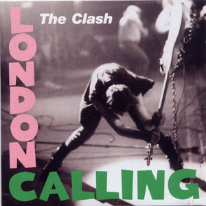
Pink and green should never be seen, goes the old fashion dictum.
But the colors, framing a black and white photo of Paul Simonon smashing his bass on stage, made for a vivid combination on The Clash's breakthrough album.
Designer Ray Lowry acknowledge the design's inspiration when he said, "It was intended as a genuine homage to the original unknown genius who created Elvis Presley's first rock 'n' roll record."
As for the photo, Simonon said, "The show had gone quite well that night, but for me, inside, it just wasn't working well, so I took it out on the bass. If I'd been really smart I would have got the spare bass out, as it wasn't as good as the one I smashed up. When I look at it now I wish I'd lifted my face up a bit more."
8. The Joshua Tree (1986)
U2
Design by Steve Averill and Anton Corbijn
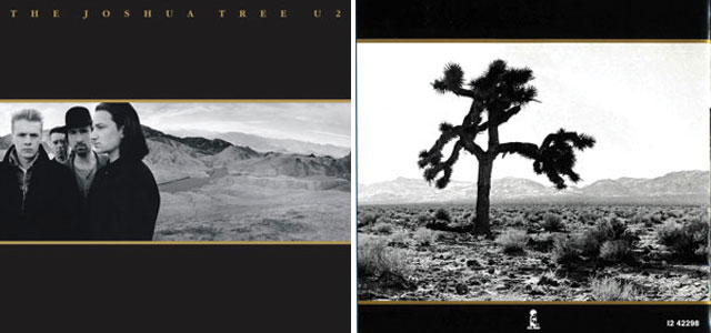
The Joshua Tree is a slow-growing shrub with sharp-tapered leaves, indigenous to the desert in the American southwest. It was named by a band of 19th-century Mormons. The tree's unique shape reminded them of the Biblical story of Joshua reaching out to the heavens.
It was this strange timeless aspect of the tree that lured U2 into Death Valley National Park in California. The cover photo, snapped by Anton Corbijn, proved a perfect foil to the grand rock hymnals on the album.
"It's supposed to be the oldest living organism in the desert," said drummer Larry Mullen, Jr.
It must have been pretty old, because it fell over and died in 2000. U2 fans have since built a makeshift shrine in the desert to commemorate the famous tree.
9. Licensed to Ill (1986)
Beastie Boys
Design by Steve Byram and World B. Omes
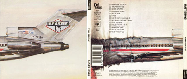
Private jets and fatal plane crashes are the heads and tails of rock 'n' roll's fateful coin.
The Beastie Boys tapped into this idea with a gatefold sleeve whose glamorous front unfolds to a charred and smoking back.
Producer Rick Rubin said the idea came from reading about Led Zeppelin's luxurious private jet. "The Beastie Boys were just a bunch of little guys and I wanted us to have a Beastie Boys' jet. I wanted to embrace and somehow distinguish, in a sarcastic way, the larger-than-life rock 'n' roll lifestyle, the excesses and the destruction."
Collage artist World B. Omes assembled the Beastie Boys jet from photographic elements (American Airlines later complained that it looked like one of theirs), then drew over and hand-colored it with water soluble crayons.
Trivia: The plane's identification number on the tail — 3MTA3 — reads "Eat Me" if you hold the cover up to a mirror.
(More from Mental Floss: An extremely brief history of World War I)
10. Odelay (1996)
Beck
Design by Beck Hansen and Robert Fisher

Look up in the sky. It's a mop. It's a throw rug. No, it's a Komondor. The airborne dog, a Hungarian breed with matted, cord-like fur, provoked a lot of "Huh?"s when this landmark album was released.
Which was exactly what Beck hoped for. A quirky artist who often relies on found objects and unintentional mistakes to inform his process, Beck stumbled on the Komondor picture in a vintage book of dog breeds.
Art director Robert Fisher said, "The photo was taken by a famous dog photographer called Ludwig, who lived a few blocks from the office. She was in her late seventies, and was enthusiastic to have a visitor.
"Beck felt that it was kind of ambiguous, unrelated to the music, and was chosen almost at random. The viewer could read into the cover whatever they wanted. Odelay also sounded a bit like a dog command."
11. Yankee Hotel Foxtrot (2002)
Wilco
Design by Lawrence Azerrad

In early 2002, fans gazing at the cover of Wilco's fourth album were asking, "What the heck are those things? Stacks of poker chips? A microscopic close-up of hair shafts? An allusion to the recently fallen Twin Towers?"
But to anyone living in Wilco's hometown, Chicago, the image was instantly familiar. Marina City, designed in 1959 by Bertrand Goldberg, is comprised of two cylindrical residential/commercial towers that cut a futuristic profile on the ChiTown skyline.
Wilco wasn't the first to show Marina City to the world. In 1973, Sly and the Family Stone featured the towers in a collage on the back cover of their classic LP There's A Riot Goin' On. And anyone who watched The Bob Newhart Show in the early '70s would've seen those towers in the opening title sequence.
Designer Lawrence Azerrad went on to do more striking artwork for Wilco, including the cover of 2011's The Whole Love.
12. Satan is Real (1960)
The Louvin Brothers
Design by Ira Louvin
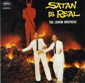
The cover of this country classic walks the line between goofy humor and heart attack seriousness. Look at that buck-toothed devil. He's more Mortimer Snerd than Mephisopheles. But there's something in the rapturous faces of the brothers that makes you think of crazy snake-handling preachers. And that's real fire dancing behind them.
Charlie Louviin said, "Ira built that set. The devil was 12 feet tall, built out of plywood. We went to this rock quarry and then took old tires and soaked them in kerosene, got them to burn good. It had just started to sprinkle rain when we got that picture taken. Those rocks, when they get hot, they blow up. They were throwing pieces of rock up into the air."
The brothers survived the cover shoot to give us their best-selling album ever. Sadly, Ira was killed in a car accident in 1965. Charlie died in 2011.
13. The Freewheelin' Bob Dylan (1963)
Bob Dylan
Design by Don Hunstein
"Meeting her was like stepping into the tales of 1,001 Arabian Nights. She had a smile that could light up a street full of people."
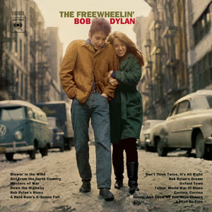
That's Bob Dylan in Chronicles, waxing poetic about Suze Rotolo, his girlfriend from 1961 to '64 and the muse clutching his arm on the cover of his breakthrough album.
The picture was taken in February 1963 by photographer Don Hunstein. Dylan was 21, Rotolo 19. The location is Greenwich Village, on Jones Street, near West 4th and Bleecker.
"I didn't do the shoot with a record cover in mind," Hunstein recalled. "I brought only one roll of color film with me, and most of the pictures on it were not good."
But the magic shot captured Dylan in all his bohemian glory, and helped make him a household name. Rotolo passed away in 2011.
14. Rubber Soul (1965)
The Beatles
Design by Robert Freeman and Charles Front
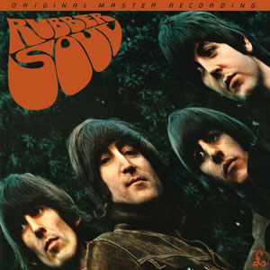
Bye bye moptops, hello Mary Jane.
For their landmark 1965 release, the Beatles traded their clean-cut image for a psychedelic look.
The slightly warped angle of the sleeve was a happy accident. "[Photographer] Robert Freeman was showing us the slides," Paul McCartney recalled. "He had a piece of cardboard that was album cover-size and he was projecting the photographs onto it. We had just chosen the photograph when the cardboard fell backwards a little, elongating the photograph. It was stretched and we went, 'That's it, Rubber So-o-oul, hey, hey! Can you do it like that?'"
Charles Front added the eye drop lettering. (Trivia: Held upside down in front of a mirror, it appears to say "Road Abbey.")
George Harrison said, "We lost the 'little innocents' tag, the naiveté, and Rubber Soul was the first one where we were fully fledged potheads."
15. Eat a Peach (1972)
The Allman Brothers Band
Design by W. David Powell and Jim Holmes
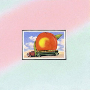
"The images on the cover are found art," says W. David Powell. "They came from postcards we picked up in a drugstore in Athens, Georgia. The postcards had the trucks with the giant peach and watermelon. I added lettering with the band name to the trucks, and pasted the cards onto a background, spray-painted pink and blue."
Inside the gatefold sleeve, Powell and his college buddy Jim Holmes collaborated on a painting of a mushroom wonderland teeming with strange creatures. "It owes a lot in inspiration to Heironymous Bosch," says Powell, then adds with a chuckle, "I don't want to reveal the background psychotropics that were involved, but we were not in a particularly rational state of mind."
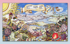
Voted by Rolling Stone as one of the top 100 album covers of all time, the sleeve image is alive and well on T-shirts and hats.
Trivia: Forty years on, an urban legend persists about the peach truck, claiming that it was the fatal vehicle in Duane Allman's motorcycle accident death. Not true.
16. Brain Salad Surgery (1973)
Emerson, Lake & Palmer
Design by H.R. Giger and Fabio Nicoli

The original title for ELP's fifth album, Whip Some Skull On Ya, was a slang term for oral sex. But the prog rockers ditched it for an even more provocative euphemism, lifted from a Dr. John song.
ELP found a sympathetic soul in Swiss designer H.R. Giger. When the band contacted him, Giger was in the midst of painting a triptych, Landscape XIX – Work Z16, whose themes, coincidentally, were penises, skulls, and a woman's mouth. The main part of this painting became the cover of Brain Salad Surgery — a woman's lips squeezed between a metal vice with a protruding phallus.
Atlantic Records objected, and a reluctant Giger airbrushed the offending member into a shaft of glowing light. If you look hard, you can make it out.
Trivia: Giger went on to design the intergalactic monster in Ridley Scott's Alien.
(More from Mental Floss: Where does the dollar sign come from?)
17. Candy-O (1978)
The Cars
Design by Alberto Vargas
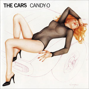
As hood ornaments go, the auburn-haired beauty reclining against the front of the Cars' second album is unbeatable.
The erotic image was created by the legendary Alberto Vargas. The Peruvian artist got his start designing posters for the Ziegfeld Follies and Hollywood movies, then made his name creating iconic WWII-era pin-up girls for Esquire magazine. He was 82 when Cars drummer David Robinson coaxed him out of retirement for one last painting.
Vargas had never heard of the Cars, but the aerodynamic model — coincidentally named Candy Moore — was much to his liking. So much so that he imagined her au naturel. Elektra Records had to insist that the old master cover up the nipples and pubic hair with a sheer body stocking.
Of the accusations that the cover was sexist, Robinson said, with his best Spinal Tap chuckle, "Maybe it is. I don't know."
18. Breakfast in America (1979)
Supertramp
Design by Mike Doud and Mick Haggerty
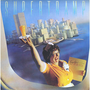
Call her the Statue of Libby. The waitress with the good old-fashioned name replaces Liberty's stone tablet and torch with a menu and a glass of fresh OJ, welcoming us to Gotham made from cups and kitchen utensils.
For this Grammy-winning cover, designers Mike Doud and Mick Haggerty set out to capture the mood of the recently relocated Brits of Supertramp to America.
"The cover expressed with wry humor our mental and physical place at that time," said sax player John Helliwell. "The imagery appealed to us — living in the land of dreams and ambitions, and substituting the English transport café for the friendly diner."
Libby was originally going to be a cheesecake-type model, but the band ended up choosing a more matronly gal from the Ugly Model Agency. She later went on tour with the band, announcing them from the stage.
19. She's So Unusual (1983)
Cyndi Lauper
Design by Janet Perr
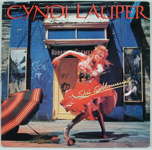
The primary color–rich cover of Lauper's debut perfectly caught her bubbly persona.
"Cyndi kept saying how she wanted peeling paint and walls that looked distressed," recalls designer Janet Perr, "and I thought Coney Island. I knew that there were a lot of abandoned, boarded up buildings there. And of course, because it was by the beach, the lighting would be really beautiful.
"We were on the boardwalk with a boom box, and Cyndi had on a great vintage dress, and she was dancing with her shoes off. She was really like that — flouncy and jumping around — and I think that really came out in the photo shoot."
Annie Leibovitz snapped Lauper in a pose like a new wave marionette.
The result: 16 million albums sold and a Grammy for design to Perr. "It was a great thing for me," Perr recalls, "because the Rolling Stones called the week after."
20. Post (1995)
Björk
Design by Paul White and Stephane Sednaoui

This cover was Björk's postcard to herself.
"The motivation behind it was her desire to be surrounded by her possessions from home," designer Paul White said. "She felt very isolated from everything in Iceland while recording the album. She was away from friends and family and communicating with them via messages. Post was about her state of mind — remote communication and a sense of awe and surprise at the changes in her life after the success of her first album."
The garishly colorful blur of a background (orange and pink are notoriously difficult for designers to bring off) is meant to symbolize both flying postcards and a tumbling house of cards. Meanwhile, Björk remains still, with the airmail braiding around her jacket communicating her longing for home.
Trivia: A discarded cover design featured Björk surrounded by silver balls with her tongue extended towards a falling silver ball.
21. OK Computer (1997)
Radiohead
Design by Stanley Donwood
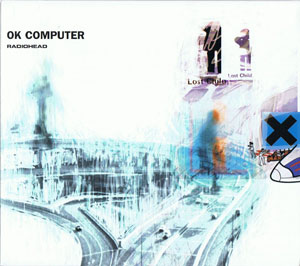
"Someone's being sold something they don't really want, and someone's being friendly because they're trying to sell something — that's what the cover means to me," said lead singer Thom Yorke. "It's quite sad, and quite funny as well."
The chilly collage of images and text was created by Stanley Donwood, who has designed all the Radiohead covers.
As for the album's title, Yorke said, "We did this promo trip to Japan, and on the last day, we were in a record shop and this one kid shouted at the top of his voice, 'OK COMPUTER!' really, really loud. Then he had 500 people chant it all at once. I got it on tape. It sounds amazing. It reminds me of when Coca-Cola did 'I'd Like to Teach the World to Sing,' that amazing advert in '70. The idea of every race and every nation drinking this soft drink. It's actually a really resigned, terrific phrase."
22. A Rush of Blood to the Head (2002)
Coldplay
Design by Sølve Sundsbø
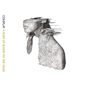
In 2002, singer Chris Martin was flipping through a back issue of Dazed & Confused magazine when he fell in love with a face. Or half a face.
Looking like some graphic novel version of an ancient Greek head bust, the striking image had been produced by fashion photographer Sølve Sundsbø. When the magazine asked him for a portrait with a "technological feel, something all white," Sundsbø swapped his camera for a 3-D scanner (of the kind often used for industrial design and prosthetics). The computerized machine couldn't read color, so the model's cape resulted in motion-like spikes. And since the scanner also had limited range, the top half of the model's head was lopped off.
Sundsbø went on to do more designs for Coldplay. And in 2010, his cover design was chosen by Britain's Royal Mail for one of their "Classic Album Cover" postage stamps.
