Formula 1 gears up for a new era - starting with a new logo
New-look design is launched at the Abu Dhabi Grand Prix, but many prefer the old one

When Liberty Media took over Formula 1 the new owners promised changes that would “benefit the sport, fans, teams and investors alike”.
On the track, Liberty’s stewardship will see the motorsport introduce new engine designs. Liberty will also introduce the “halo” cockpit safety system next year.
Off the track, there are big changes afoot for F1. That’s because after 23 years the sport’s logo has been given a major makeover.
The Week
Escape your echo chamber. Get the facts behind the news, plus analysis from multiple perspectives.

Sign up for The Week's Free Newsletters
From our morning news briefing to a weekly Good News Newsletter, get the best of The Week delivered directly to your inbox.
From our morning news briefing to a weekly Good News Newsletter, get the best of The Week delivered directly to your inbox.
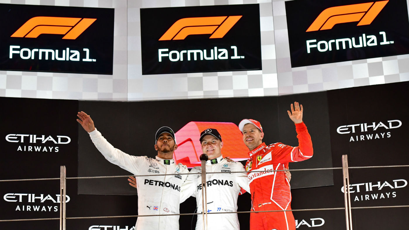
Launched on the podium at the season-ending Abu Dhabi Grand Prix this weekend, the new F1 logo’s design is dividing opinion among drivers and fans.
World champion Lewis Hamilton, who finished second behind his Mercedes teammate Valtteri Bottas in Abu Dhabi, is not too keen on the logo’s new look but hopes he will eventually come round.
Quoted by Autosport, Hamilton said: “I think the one that we already had was an iconic logo. Just imagine Ferrari changing their logo, or Mercedes changing their logo. I don’t think the new one is as iconic but maybe it will grow on us.”
Ferrari’s Sebastian Vettel, who was third in Abu Dhabi, was also unenthusiastic. “I liked the old one better.”
A free daily email with the biggest news stories of the day – and the best features from TheWeek.com
The new logo is part of a wider plan by Liberty Media to make F1 more exciting – and to improve the sport’s branding, marketing and digital platforms. Creative Review says the new identity “cements a year of change for F1 as it hopes to re-engage its global fanbase”.
Launched after extensive research and fan feedback, the new logo has gone down well, F1’s director of marketing Ellie Norman told the Independent.
“Having shared it with the teams in Abu Dhabi on Thursday, and with our sponsors and partners on Wednesday, the feedback... has been incredibly positive,” she said.
The sport’s governing body, the FIA, has given its official backing to the new look. President Jean Todt has described it in positive terms as an “evolution”. He told Autosport that the FIA has faith in Liberty, adding that they were making changes for the right reasons.
“If the result of the studies demonstrates that it is in the interest of the development of F1, I think we should encourage that,” he said.
But not everyone is happy with the new logo. After its launch, many fans and pundits had their say on Twitter:
Saying goodbye to an “icon”.
The Sun’s Ben Hunt thinks he has seen this font before…
It was a weekend of “lasts” in Abu Dhabi.
A “soulless doodle” said one fan.
