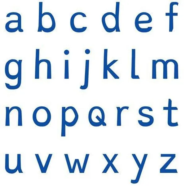
A new typeface could help people with dyslexia read with ease
(Image credit: Twitter.com/Dezeen)
A Dutch designer has created Dyslexie, a typeface that he hopes will make it easier for people with dyslexia to read.
The Week
Escape your echo chamber. Get the facts behind the news, plus analysis from multiple perspectives.
SUBSCRIBE & SAVE

Sign up for The Week's Free Newsletters
From our morning news briefing to a weekly Good News Newsletter, get the best of The Week delivered directly to your inbox.
From our morning news briefing to a weekly Good News Newsletter, get the best of The Week delivered directly to your inbox.

Explore More
