The new World Trade Center logo provides a bittersweet reminder of its history
The World Trade Center revealed its new logo Wednesday, and its simple design is a perfect reflection of the building's history and rebirth.
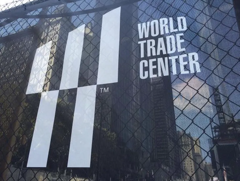
The logo doubles as a trident, representing the "three-fingered steel columns at the base of the twin towers, still standing after the 2001 attack" and as a capital "W," according to The New York Times. The "W" stands for World Trade Center as well as for the Westfield World Trade Center shopping area that will open in 2015.
The Week
Escape your echo chamber. Get the facts behind the news, plus analysis from multiple perspectives.

Sign up for The Week's Free Newsletters
From our morning news briefing to a weekly Good News Newsletter, get the best of The Week delivered directly to your inbox.
From our morning news briefing to a weekly Good News Newsletter, get the best of The Week delivered directly to your inbox.

