The American prison population, in one chart
John Moore/Getty Images


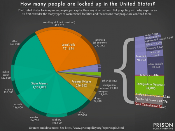
As is well known, America has the highest incarceration rate in the world, with 743 out of 100,000 people imprisoned. But given how prisoners are distributed across thousands of federal, state, and local institutions, it's been hard to get a good sense of how exactly the prison population breaks down.
Until now. The Prison Policy Initiative put together this amazing pie chart that lets you take in all 2.4 million prisoners at a glance.

Here's a small disclaimer:
The Week
Escape your echo chamber. Get the facts behind the news, plus analysis from multiple perspectives.

Sign up for The Week's Free Newsletters
From our morning news briefing to a weekly Good News Newsletter, get the best of The Week delivered directly to your inbox.
From our morning news briefing to a weekly Good News Newsletter, get the best of The Week delivered directly to your inbox.
While the numbers in each slice of this pie chart represent a snapshot cross section of our correctional system, the enormous churn in and out of our confinement facilities underscores how naive it is to conceive of prisons as separate from the rest of our society. In addition to the 688,000 people released from prisons each year, almost 12 million people cycle through local jails each year. [The Prison Policy Initiative]
I highly recommend reading through the full report (which isn't too long), or clicking around to some of their other work. Very good, urgently necessary stuff.
A free daily email with the biggest news stories of the day – and the best features from TheWeek.com
Ryan Cooper is a national correspondent at TheWeek.com. His work has appeared in the Washington Monthly, The New Republic, and the Washington Post.

