Last summer, CERN was on the verge of announcing a discovery so critical to understanding the basic building blocks of the universe that it had been given a divine name: The God particle.
The hunt for the Higgs boson was one of the most expensive and labor-intensive particle physics projects ever undertaken, and promised to answer the fundamental but elusive question of why our atoms stick together in the first place. And yet, when CERN researchers finally announced that they'd glimpsed the Higgs, the world's first reaction wasn't to cheer; it was to stifle collective laughter. The institution's scientists, cradling the most important scientific discovery of the decade, had chosen to present their findings to a breathless public using a peculiar font face: Comic Sans MS.
The whole kerfuffle underscored just how important typefaces are to the way we process information. Words hold power. But the aesthetic manner in which those words are presented can affect the way we read, and the way we think about the information presented.
The Week
Escape your echo chamber. Get the facts behind the news, plus analysis from multiple perspectives.
"Typography is one ingredient in a pretty complicated presentation," Cyrus Highsmith, a typeface designer and author of the book Inside Paragraphs, told me over the phone. "Typography is the detail and the presentation of a story. It represents the voice of an atmosphere, or historical setting of some kind. It can do a lot of things."
Part one was an ordinary article about a scientific study concerning optimism versus pessimism. In part two, with the help of Cornell psychologist David Dunning, Morris designed a quiz to evaluate whether the Times' readers found the study's conclusions believable.
Sign up for Today's Best Articles in your inbox
A free daily email with the biggest news stories of the day – and the best features from TheWeek.com
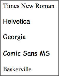
Here's the catch. When readers came to the site, the story was presented in different typefaces: Baskerville, Computer Modern, Georgia, Helvetica, Comic Sans, and Trebuchet. Roughly 40,000 people responded to the quiz, and the results were weighted to evaluate which fonts inspired more confidence in the research, and which fonts made the information appear less believable. Here's what Morris found:
The conscious awareness of Comic Sans promotes — at least among some people — contempt and summary dismissal. But is there a typeface that promotes, engenders a belief that a sentence is true? Or at least nudges us in that direction? And indeed there is.
It is Baskerville.
Believe it or not, the results of this test even show a disparity between Baskerville and Georgia — two apparently similar serif typefaces. [New York Times]
Baskerville's weighted advantage wasn't huge — just 1.5 percent. "That advantage may seem small," Dunning told the Times, "but if that was a bump up in sales figures, many online companies would kill for it. The fact that font matters at all is a wonderment."
Why was Baskerville more believable? Dunning had a theory:
The word that comes to my mind is gravitas. There are some fonts that are informal — Comic Sans, obviously — and other fonts that are a little bit more tuxedo. It seems to me that Georgia is slightly tuxedo. Computer Modern is a little bit more tuxedo and Baskerville has just a tad more starchiness. I would have expected that if you are going to have a winner in Baskerville, you are also going to have a winner in Computer Modern. But we did not. And there can be a number of explanations for that. Maybe there is a slight difference in how they are rendered in PCs or laptops that causes the starch in Computer Modern to be a little softer than the starch in Baskerville. [New York Times]
***
A lot goes into typeface design that we tend not to think about. Online, it's commonly understood that serifs, or fonts with a tiny line tailing the edges of the lettering, like Times New Roman, help influence the horizontal flow of reading. In reality, it's not that simple. (User-interface designer Alex Poole pored over 50 empirical studies for his master's thesis if you're interested in learning more.)
"There are many very readable sans serif typefaces out there. Plus some shapes of serifs might actually hinder readability if they are too prominent or draw too much attention to themselves," Alexander Tochilovsky, a design instructor at the Cooper Union School of Art, told me in an email. "Besides the formal qualities of the typeface, [or] the structure of the letters, a lot also depends on how the fonts are employed, and for what purpose." He continued:
Size of type, letter-spacing, word-spacing, leading (interline spacing), column width, justification, etc., all play a key role in how readable a passage of text is (or isn't). Text meant for a book requires a different approach of typesetting from one that is meant to be seen on a poster.
Type design is something we tend not to think about when we're reading. But font can have real-world implications that affect our lives in tangible ways.
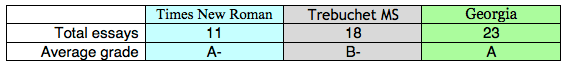
Take this somewhat famous quasi-experiment by university student Phil Renaud back in 2006 (preserved for posterity in Pastebin form). Over the course of six semesters, Renaud wrote 52 essays for his classes, earning himself a commendable A- overall.
Here's the thing: Toward the end of his last semester, Renaud's average essay score began climbing. "I haven't drastically changed the amount of effort I'm putting into my writing," he wrote. "I'm probably even spending less time with them now than I did earlier in my studies."
What he did change, however, was his essay font — three times, in fact. Renaud went back and looked at his essay scores and the different typefaces he'd used when he submitted his work. His papers were handed to his professors in three different fonts: Times New Roman, Trebuchet MS, and Georgia. Here's what he tallied:
Why did Georgia — which he switched to later on in his college career — perform better than the others? Here's what Renaud wrote:
Maybe fonts speak a lot louder than we think they do. Especially to a professor who has to wade through a collection of them; Times seems to be the norm, so it really doesn't set off any subconscious triggers. Georgia is enough like Times to retain its academic feel, and is different enough to be something of a relief for the grader. Trebuchet seems to set off a negative trigger, maybe just based on the fact that it's not as easy to read in print, maybe on the fact that it looks like something off a blog rather than an academic journal. Who knows. [Source]
Indeed, Renaud's observations were consistent with a 1998 study from Carnegie Mellon, which pitted Times New Roman against Georgia. Participants overwhelmingly preferred Georgia over its stodgier doppelgänger, judging Georgia to be "sharper, more pleasing, and easier to read."
Why, then, does everyone hate Comic Sans MS? Author and designer David Kadavy had the same question, and compared the child-like scribble to another face that's inversely beloved on the other end of the spectrum: Helvetica.
Kadavy argues that a "mismanagement of visual weight is the main issue that makes reading Comic Sans an unpleasant experience. Evenness of weight, or 'texture' is important to the legibility and readability of typography." It's partly why Helvetica's aesthetic appeal is so universal.
Which isn't to say there's a one-size-fits all prescription for what kind of font is best for reading, or writing. As with all things, there are all kinds of factors you have to consider: Your audience (what typeface are they comfortable reading?), and the medium you're delivering your words on (a computer screen is different from the squinty lines in a novel, for example).
In the end, it all "comes back to the context or purpose that fonts are being used for," Tochilovsky told me. "There is a lot that is going on within any given font, often imperceptible to the eye."
Chris Gayomali is the science and technology editor for TheWeek.com. Previously, he was a tech reporter at TIME. His work has also appeared in Men's Journal, Esquire, and The Atlantic, among other places. Follow him on Twitter and Facebook.