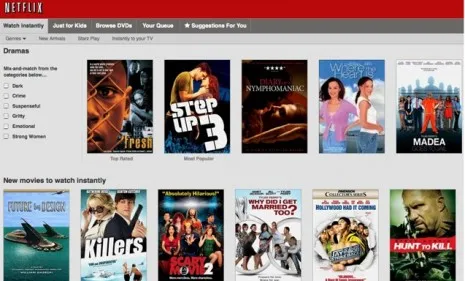
Netflix launched a major website redesign late last week, provoking "blind rage" from "an avalanche of users" who bombarded message boards and Twitter with "howls" of disapproval. The new interface focuses on the site’s "watch instantly" service, replacing sortable, text-heavy lists with a more image-driven look and clickless scrolling. On its official blog, Netflix said the changes should simplify instant viewing, though the nearly 5,000 comments on the post suggest that the site's users liked the old interface just fine. Sample comment: "Netflix redesign is great if you like ugly, functionless things." Is it really that bad?
It's "slow" and "ugly": "Seriously, who does [Netflix's] quality-control?" asks Kristofer Brozio at Review the Tech. The thumbnails of movie posters resemble "blurry blobs," and the new clickless scrolling feature "crawls along at a snail's pace." The site is "almost unusable," and has users clamoring for the option to go back to the way it was. "It's just horrible."
The Week
Escape your echo chamber. Get the facts behind the news, plus analysis from multiple perspectives.

Sign up for The Week's Free Newsletters
Join more than 350,000 subscribers and keep yourself informed with a selection of The Week’s most interesting, enlightening and entertaining stories - plus daily puzzles.
Join more than 350,000 subscribers and keep yourself informed with a selection of The Week’s most interesting, enlightening and entertaining stories - plus daily puzzles.


