The Colour of Branding
James Morris explains why companies choose their corporate colour schemes, and what they mean.
According to the World Intellectual Property Organisation, companies spend $466 billion globally a year on branding. Significant to a corporate brand are the colours chosen, both for the company's logo and the ancillary image that goes with it. In this feature, we look at the influences on the colours chosen for various types of business, with the insight of branding experts Russell Jones and Scott King from Condiment Junkie
Fire and fruit
Colour is very emotive, and there are some clear psychological effects associated with certain colours, which even cross cultural boundaries. For example, anthropological research has shown that red is universally the first colour that human beings discern after differentiating black and white. Its association with fire and ripe fruit make it fundamentally important for our survival instincts, and this has persisted to this day. This association with danger and courage explains why red sports cars are perceived as more exciting; brands frequently use this colour to get your attention.
Our responses to other colours are far more complicated. For example, pink is best known to evoke an effect, particularly in the form of Baker-Miller Pink, named after two US Navy officers who first used it at a Navy correctional facility in 1979. Pink has connotations of tranquillity and warmth, and research conducted by Alexander Schauss in the US has shown that it can have a real effect on the calmness of those perceiving it. By painting the correctional facility they ran in this colour, Baker and Miller recorded a significant reduction in violent behaviour.
The Week
Escape your echo chamber. Get the facts behind the news, plus analysis from multiple perspectives.

Sign up for The Week's Free Newsletters
From our morning news briefing to a weekly Good News Newsletter, get the best of The Week delivered directly to your inbox.
From our morning news briefing to a weekly Good News Newsletter, get the best of The Week delivered directly to your inbox.
Choosing the right fit
While colour preferences can be very personal, studies have shown that the success of a brand depends greatly on whether the colours chosen fit the brand profile. However, this can mean different things in different markets. As Jones and King point out in our video about choosing the right colour for your logo, certain industries have settled on somewhat fixed colours. For example, banks have tended to go for red or blue, or both. Dark-blue hues are associated with clear and deep thought. Although blue is often thought of as being cold and unemotional – this is potentially the image a bank may want to portray. The courageousness associated with red could also be beneficial for a financial institution. So when the new Metro Bank arrived in 2010, it closely followed the market norm, with a red and blue logo. Similarly, supermarkets frequently opt for logos using yellow and green, which have connotations of freshness, sunshine and natural produce, which are entirely appropriate for shops selling food.
In the technology industry, green has been associated with graphics vendor Nvidia for the past decade, with red denoting AMD's graphics division, formerly ATI. In both cases, the colour association stems from a long-time use of the colours in logo branding, and now represents the binary opposition between the two companies. Some colours are associated with brands, however, which is separate from their actual logos. As King points out in our video, the luxury car market is a particularly salient example of this, most notably Ferrari's use of bright red, Bentley's use of British Racing Green, and Aston Martin's use of dark metallic grey. Lamborghini sports cars are frequently bright yellow, or sometimes bright green or orange, but generally the colours chosen aren’t subtle, which fits well with the image of excess that the brand represents.
Differentiation, personality, context and gender
Colour can also help differentiate the arrival of a new brand, with some companies choosing to build their entire strategy around this: the phone company Orange, for example. Arriving in an already crowded market in 1994, Orange was introduced as an exciting newcomer, with the brand name tying in appropriately with the slogan "The future’s bright, the future’s Orange”. The brand also diverged from the technology-evoking names of the time, such as Vodafone and Cellnet, towards something with which everyone could associate. Although EE has begun to phase out the Orange brand in 2014 in the UK, it remains an incredibly powerful example of simple colour in branding, and continues in other regions.
According to the Stanford psychology professor Jennifer Aaker, there are five core dimensions to a brand's personality – sincerity, excitement, competence, sophistication and ruggedness – with each brand primarily focusing on one of the dimensions. This dimension is expressed through the use of colour in logos and other aspects of a company’s branding. Blue's association with intellectual calmness and competence has made it a popular choice in many brands, for example, and it’s been called the world's favourite colour. Intel's use of blue plays on this theme considerably. Waiting rooms are often light blue because of the calming effect this can have on those who find themselves spending extended time in one.
Our reaction to a colour changes with context, too. Brown, for example, can be considered an unpleasant colour. But associate it with coffee or chocolate and views change. It also has connotations of ruggedness, so it's much more appropriate for a brand producing equipment for outdoor use than a luxury car company. Of course, as with any creative process, for every trend in one direction there’s always an exception. Jones and King point out that Walkers switched from using green for its packaging of cheese and onion crisps, to blue, which was also the opposite colour choice of most other snack brands. This doesn't appear to have affected sales, and the reasoning for the switch remains obscure.
There are clear gender biases in colour preferences, too. Research has shown that while blue is universally the favourite across men and women, purple is almost as unpopular with men as it is popular with women, making it a poor choice if you’re marketing a male-orientated brand or one intended to appeal to both sexes. Similarly, colours have different associations across cultures. Gold, for example, is favoured as a sign of premium value in Asian cultures, but often considered too showy in the West.
Colour in branding – not so black and white
The absence of colour can be equally effective as its presence. Apple has famously used white to communicate its clean, simple design ethos – so much so that an advertisement using minimal graphics on a white background already hints at an Apple product. Conversely, the seriousness of black, and its legibility against lighter backgrounds, makes it the obvious choice for a no-nonsense image.
While there are some very well researched guidelines about the possible psychological effects of colour, tastes are sufficiently personal and capricious for nothing to be set in stone. So the theory can guide suggestions, but only market testing can really show whether a colour branding choice will have the desired effect.
For more advice on transforming your business, visit HP BusinessNow
A free daily email with the biggest news stories of the day – and the best features from TheWeek.com
-
 Music reviews: Yaya Bey and Nine Inch Nails & Boys Noize
Feature ‘Fidelity’ and ‘Nine Inch Noize’
-
 Art review: David Geffen Galleries
Feature Los Angeles County Museum of Art
-
 Book reviews: ‘Mutiny: The Rise and Revolt of the College-Educated Working Class’ and ‘Famesick: A Memoir’
Feature Shining the spotlight on young labor activists and Lena Dunham names names
-
 The executive style guide
feature Want to stand out from the business crowd? Here's all the kit you need.
-
 Seven ways to reduce stress in your office
feature You can’t completely remove it from your life, but there are some easy ways to relieve it…
-
 Hello Fresh: The transformation begins
feature New offices and a wealth of new IT from HP for Hello Fresh.
-
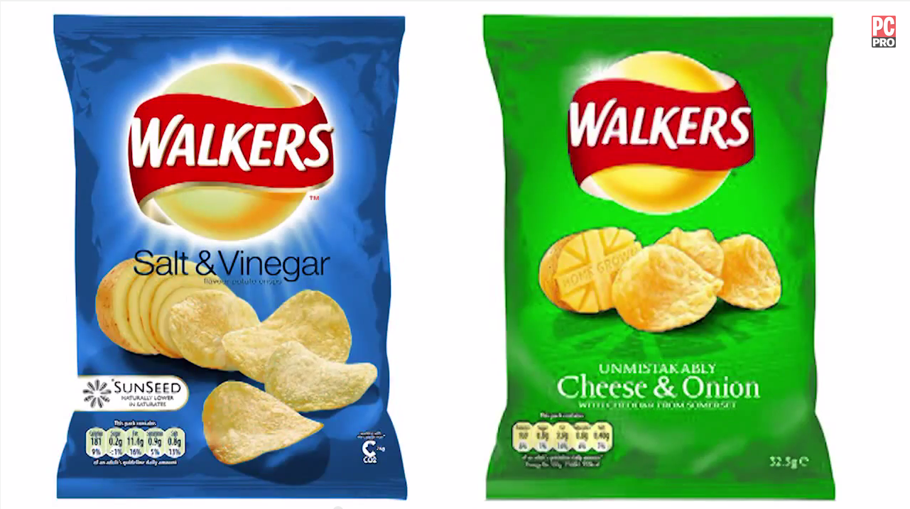 Controversial Colour Branding Decisions
feature Scott King and Russell Jones from Condiment Junkie discuss how some brands have decided to swim against the tide with their colour choices.
-
 How do you design a computer?
feature Lead designer of HP, Chad Paris, explains how new computers are brought to life
-
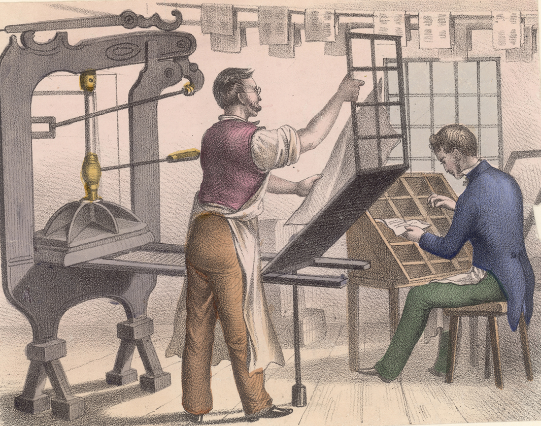 The story of print
feature Printing has come a long way since its origins. Here we map out the story of print past, present and future
-
 Tribal Colours
feature Colour has been used for centuries as a means to communicate where we belong, finds Stuart Andrews
-
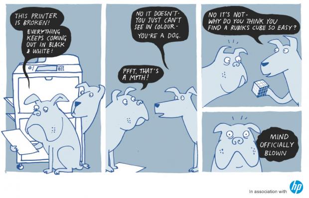 Does colour exist?
feature Red and yellow and pink and green – scientists say that these are all just figments of your imagination