This chart shows the average wage for nearly all American jobs
A free daily email with the biggest news stories of the day – and the best features from TheWeek.com
You are now subscribed
Your newsletter sign-up was successful
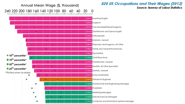
Endeavoring Reddit user Dan Lin used data from the Bureau of Labor Statistics to create a comprehensive chart of the average wage for nearly every job in America.
Lin's chart is color-coded by industry, and the parenthetical number at the right of each bar shows the mean wage (in thousands). The various shapes demonstrate the salary range in each field.
Unsurprisingly, the highest wages are all in medical fields, which are fuchsia on the chart, while the lowest wages are in the hospitality and food industries, which are pea green and lime green on the chart, respectively. The top mean wage is for anesthesiologists at $235,100 a year, followed closely by surgeons at $233,200 a year. The lowest mean wage goes to fast food cooks at just $18,900 a year.
The Week
Escape your echo chamber. Get the facts behind the news, plus analysis from multiple perspectives.
Sign up for The Week's Free Newsletters
From our morning news briefing to a weekly Good News Newsletter, get the best of The Week delivered directly to your inbox.
With 820 jobs included in Lin's chart, it's too long to include the whole thing here. But if you want to see the full list in all its glory, click the image below and zoom to enlarge. --Meghan DeMaria
A free daily email with the biggest news stories of the day – and the best features from TheWeek.com
Meghan DeMaria is a staff writer at TheWeek.com. She has previously worked for USA Today and Marie Claire.
