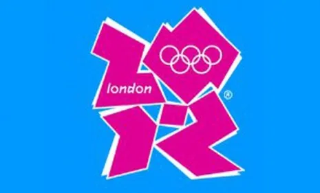
The jazzy logo for the 2012 London Summer Olympics has become something of a Rorschach test for conspiracists. (See it for yourself below.) This week, Iran threatened to boycott next year's Games over the "racist" implications of the logo. But others have come up with even odder interpretations. Here, a short list of hidden meanings in the 2012 logo:
1. The pro-Zionist interpretation
Bahram Afsharzadeh, the secretary-general of Iran's National Olympic Committee, has threatened to boycott the Games. What's the problem? Iran says if you look closely, the logo resembles the word "Zion." What a surprise, says Max Read at Gawker. "The Iranian government is making noise about something bizarre and tenuously related to Jews." Did they consider the organizers might just be "huge Bob Marley fans"?
The Week
Escape your echo chamber. Get the facts behind the news, plus analysis from multiple perspectives.
SUBSCRIBE & SAVE
Sign up for The Week's Free Newsletters
From our morning news briefing to a weekly Good News Newsletter, get the best of The Week delivered directly to your inbox.
From our morning news briefing to a weekly Good News Newsletter, get the best of The Week delivered directly to your inbox.
Latest Videos From
2. The Lisa Simpson interpretation
When the logo was unveiled, many said they could see beloved cartoon character Lisa Simpson engaged in decidedly family-unfriendly behavior. "Was there nobody in the room who snickered when this new logo was revealed today?" wrote Tony Pierce at LAist, back in 2007. Perhaps this is "just some brilliant underground viral marketing for the upcoming Simpsons movie."
3. The Nazi interpretation
Some say it looks like a bad piece of 1980s font-work, said cartoonist Rod McKie at his blog. But "I think it bears startling similarities to a much older design" — that of the Waffen SS, the Nazis' secret police. What an "absolute disgrace."
4. The other Nazi intepretation
The Waffen SS is the least of it, said Zennie Abraham at his blog. To me, it resembles nothing less than a swastika. "The logo has the same four-square-corners rotating around a center look." Worse yet, it looks like someone realized that, and "decided to turn the logo so that it was more square than diamond." But they're not fooling anyone.
5. The Jay-Z interpretation
If you read the logo "counterclockwise from the bottom left," says Chris Chase at Yahoo! Sports, it also resembles the word "Izzo" — as in the nickname of hip-hop superstar Jay-Z. That might draw copyright complaints, or at least "cries of protest from Ohio State fans," whose rival basketball team, the Michigan State Spartans, is coached by Tom Izzo.