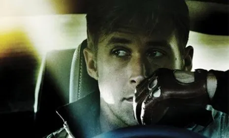
The image: The hotly anticipated movie Drive, a violent Ryan Gosling vehicle from Danish auteur Nicolas Winding Refn, opens Friday. But in recent weeks, the font used for the film's brooding marketing campaign (see poster below) has generated nearly as much buzz as the thriller's star. Against an eerily desaturated, menacing image of Gosling glancing sideways, the film's title is spelled out in a chipper pink cursive — a font that's arguably better suited to a poster for an 80s cheerleader flick. (Compare the molten, macho type used for iconic car flick, The Fast and the Furious.) What gives?
The reaction: "The flamboyant, pink script" makes Drive look nothing "like an ordinary crime thriller," says John Horn in the Los Angeles Times. In this case, that's truth in advertising. This gory, unique film "is an unusual mash-up of art-house style and commercial genre moviemaking." But the font just reads as campy, says Natalie Zutter at Crushable. The poster "resembles a preteen’s folder with 'Mrs. Ryan Gosling' scrawled on it in gel pen." Yeah, this "hilariously outdated pink font" seems like a joke, says Annie Barrett in Entertainment Weekly. It makes me think of the classic 80s flick Heathers. I can only hope that Gosling's film also features Slurpees and "murdering mean girls." Judge for yourself:
The Week
Escape your echo chamber. Get the facts behind the news, plus analysis from multiple perspectives.

Sign up for The Week's Free Newsletters
From our morning news briefing to a weekly Good News Newsletter, get the best of The Week delivered directly to your inbox.
From our morning news briefing to a weekly Good News Newsletter, get the best of The Week delivered directly to your inbox.