Sign up for The Week’s free daily newsletter, Today’s Best Articles
Join 350,000+ subscribers and keep yourself informed with a selection of
The Week’s most interesting, enlightening and entertaining stories - plus daily puzzles.
You are now subscribed
Your newsletter sign-up was successful
An account already exists for this email address, please log in.
2018 World Cup logo: Roger the Alien or Finding Nemo?
The Sputnik inspired emblem has 'magic windows' - but not everyone is impressed
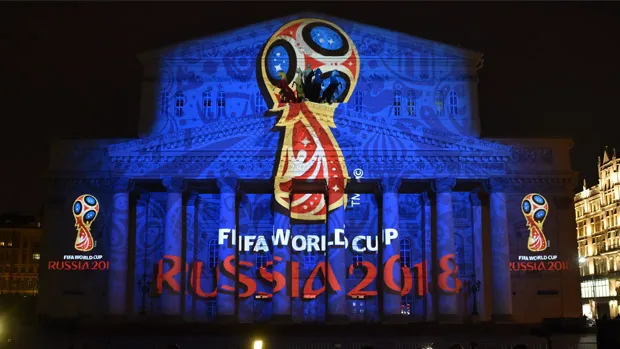
The logo for the 2018 World Cup in Russia was unveiled by Sepp Blatter this week, with some help from cosmonauts aboard the International Space Station, but inevitably not everyone approved of the design.
The emblem, which was beamed onto the side of the Bolshoi Theatre in Moscow during the launch, depicts the World Cup trophy in red and blue, the colours of the Russian flag, with gold trim.
Fifa president Blatter, who orchestrated the launch on Russian TV on Tuesday evening, said the logo showed Russia's "heart and spirit".
The Week
Escape your echo chamber. Get the facts behind the news, plus analysis from multiple perspectives.
Unsurprisingly the design agency behind the emblem, Brandia Central, was rather more effusive, describing Russia as "the land of magic". It explained that the design had "a sense of elevation, of ascending, like a spacecraft" and that the design was partly inspired by the shape of a Sputnik satellite, complete with "magic windows".
Many critics of the design agreed that it had an out-of-this-world feel, but compared it to the character Roger the Alien from cartoon show American Dad.
One is the new World Cup logo. The other is Roger from American Dad. Which is which? #WorldCup2018 pic.twitter.com/geq3mB3rqc — Iain Munro (@iamthemunro) October 28, 2014
Others saw rather more prosaic similarities, likening the design to that of an electric shaver and a moptop Beatles-style haircut.
2018 World cup logo. Close enough pic.twitter.com/FU7k1Z9oEA — GeniusFootball (@GeniusFootball) October 29, 2014
Anybody think the #Russia2018 logo looks like it has a little shaggy hairdo? Back in the USSR, y'all. pic.twitter.com/6Da5LnTocr — Killy Fiendly (@billykeenly) October 28, 2014
There were plenty of other cartoon comparisons, including characters from Finding Nemo and the Super Mario games, as well as to Edward Munch's famous painting The Scream, althgough when compared to previous designs this one got off relatively lightly.
Sign up for The Week’s free daily newsletter, Today’s Best Articles
Join 350,000+ subscribers and keep yourself informed with a selection of
The Week’s most interesting, enlightening and entertaining stories - plus daily puzzles.
Turn the new #Russia2018 World Cup logo on it's side and... #FindingNemo pic.twitter.com/OMG8HKMfLX — Conor McNamara (@ConorMcNamaraIE) October 29, 2014
¿Un mensaje subliminal de FIFA su logo para #2018WorldCup? pic.twitter.com/0bixPPvxSj — סרג'יו (@cHoKo_yea) October 28, 2014
Edvard Munch is the man behind the #Russia2018 logo, apparently. pic.twitter.com/UpH0SoVA6m — Lee Thomas-Mason (@LeeThomasMason) October 29, 2014