As anyone who works in design or marketing will tell you, colours matter. Reds can be warm, hostile or attractive. Greens can be calming, oranges confident or cheerful, blues dependable. But how do colours affect our perceptions of a person, a place or a product, and why? In particular, why have so many technology companies branded themselves with the colour blue? What is it about blue that makes the likes of HP to Facebook decide that it’s right for them?
Brand values
Branding experts and advertising gurus have long believed that certain colours stand for certain values, and while you can take some claims with a pinch of salt, there is evidence to back it up. Colours in the red spectrum – red, orange and yellow – are often associated with heat, passion or excitement, while colours in the blue spectrum – blues, greens and purples – are seen as calming, but also as cold. To an extent, these associations seem to cross national and cultural borders. A 2004 study sampled people from five countries and six cultures across Europe, asking them to pick a group of colours that matched a group of adjectives. Seventy-seven per cent of the respondents made the same choices overall, rising to 90 per cent on one specific colour group.
Emotional state
Colour can affect us psychologically and emotionally. Some studies have shown that people feel warmer in a warm-coloured office and cooler in a blue or green one, even with the temperature at the same level. Other studies have shown that those in a casino will gamble more and make riskier bets when seated under a hot colour. The colour of a medicine can affect a patient’s perception of their treatment. Stimulants with hot colours may be perceived as more effective, and the same with cool-coloured depressants.
The Week
Escape your echo chamber. Get the facts behind the news, plus analysis from multiple perspectives.

Sign up for The Week's Free Newsletters
From our morning news briefing to a weekly Good News Newsletter, get the best of The Week delivered directly to your inbox.
From our morning news briefing to a weekly Good News Newsletter, get the best of The Week delivered directly to your inbox.
Some scientists believe that colour can affect how we perform on simple tasks. In 2009, Ravi P. Mehta and Rui Zhu of the University of British Columbia found that test subjects performed better when recalling words or proofreading text if they had a red, rather than a blue, desktop background on their computer. Yet the opposite was true with creative tasks, or when faced with constructing an inventive toy from blue parts, as opposed to red ones.

Mixing it up
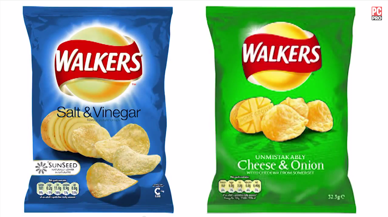
Colours can also affect our other senses, a phenomenon scientists describe as ‘synaesthesia.’ Certain colours, for example, might be associated with certain tastes. In 1980, a study for the Journal of Food Science noted that subjects found it easier to identify a drink when it was of the expected colour. More recently, the Oxford-based experimental scientist Charles Spence has tricked people into confusing salt and vinegar and cheese and onion crisps by switching the colours of packets. It appears that we can be fooled into tasting the colour, not the crisp itself.
To an extent, our identifications between colours and emotions may be hardwired. The association of blue and green with peace, tranquillity and growth, may be because they relate to the positive things – such as sky, water and vegetation – that we’d once have looked for in the natural world. Red, meanwhile, is associated with fire, danger and alarm, but also sexual arousal. Colour association may be a question of evolutionary aesthetics; of tastes that have evolved to enhance our chances of surviving and reproducing. In 2011, scientists from Dartmouth College, New Hampshire, observed that male rhesus macaques will take apple slices from a man or woman clad in blue or green, but not from either gender dressed in red.
Out of the blue
These associations tie into the food we buy, the clothes we wear and the cars we drive. They also tie into branding. It’s hard to imagine Coca Cola without red and white; McDonalds without the golden arches; or Cadbury’s without its purple. Many hi-tech companies, meanwhile, see blue as an essential part of their identity, with major brands such as HP, Dell, IBM, Facebook, Intel, Twitter, Philips and Samsung among them. Why? First, blue is popular across both men and women, and popular across brands as a whole. A study of the world’s top 100 brands found that 33 per cent used blue, ahead of red (29 per cent), black or grey (28 per cent) and yellow (13 per cent). Beyond this branding, experts believe that blue gives consumers a sense of trust and security about a brand. Blues can be conservative and businesslike – which is why so many financial institutions use them – but they’re also harmonious, dependable, communicative and strong. Blue may help calm consumers stressed about new technologies, communicating to them that their new computers or gadgets will be dependable and useful. Blue also works well in the corporate sector, sending a subtle message to those in the boardroom that this is technology their business can rely on. What’s more, the use of blue by some major companies helps to reinforce its use by others. If you buy and trust processors from Intel, you can buy and trust a laptop from HP.
So is this marketing mumbo jumbo? Maybe, but don’t discount it. When a huge company chooses to make a colour such a major part of their brand value, it’s because they believe it communicates with something deep inside many of us.
For more advice on transforming your business, visit HP BusinessNow
-
 Political cartoons for July 25
Cartoons Saturday's political cartoons include campaign commercials, hazmat suits, and more
-
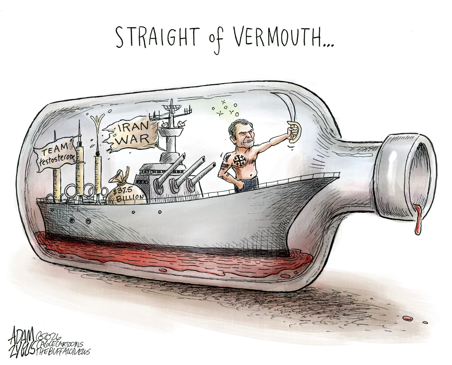
 The Iran war: ‘despair’ in Washington
In The Spotlight President’s claims of victory over Iran have ‘bordered on delusional’ as crisis continues to deepen
-
 Kevin Keegan obituary: a ‘riot of colour’ in a grey world
In the Spotlight ‘King Kev’ was beloved on the pitch, and represented a new breed of celebrity footballer


-
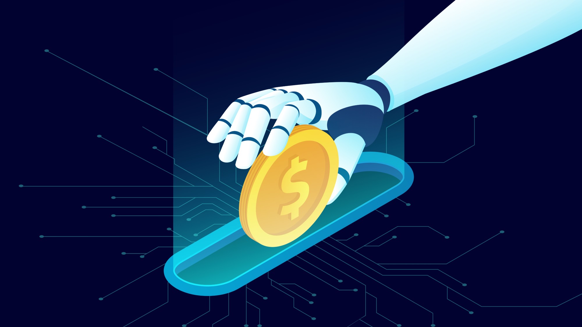 Tokenmaxxing: the AI workplace trend pushing rapid integration
The Explainer Companies are gamifying AI utilization and spending thousands in tokens weekly
-
 The executive style guide
feature Want to stand out from the business crowd? Here's all the kit you need.
-
 Seven ways to reduce stress in your office
feature You can’t completely remove it from your life, but there are some easy ways to relieve it…
-
 Hello Fresh: The transformation begins
feature New offices and a wealth of new IT from HP for Hello Fresh.
-
 Controversial Colour Branding Decisions
feature Scott King and Russell Jones from Condiment Junkie discuss how some brands have decided to swim against the tide with their colour choices.
-
 How do you design a computer?
feature Lead designer of HP, Chad Paris, explains how new computers are brought to life
-
 The story of print
feature Printing has come a long way since its origins. Here we map out the story of print past, present and future
-
 Tribal Colours
feature Colour has been used for centuries as a means to communicate where we belong, finds Stuart Andrews


