Why 2020 Democrats are ditching the red, white, and blue
From their logos, at least

A free daily email with the biggest news stories of the day – and the best features from TheWeek.com
You are now subscribed
Your newsletter sign-up was successful
On Monday, former Colorado Gov. John Hickenlooper entered the 2020 Democratic presidential primary as a frontrunner. Not for the actual nomination, of course — FiveThirtyEight has the centrist candidate polling between 0 and 1 percent — but as the undisputed champion of the logo game.
This year, that's not nothing. Of the now 14 different Democratic candidates officially running for office in 2020, just four have what might be considered "traditional" logos incorporating the red, white, and blue of the American flag. The rest of the presidential hopefuls have branded their campaigns with hues of "liberty green" to hot pink to vintage yellow. And as each of their future lawn signs serves to prove, this crop of candidates is appealing to a new demographic of voters, and turning the tide on a dated portrait of America.
There is not a long history of viable presidential contenders using alternative colors for their campaign logos. Most famously, Jimmy Carter won the White House using an intentionally untraditional dark green in 1976. But the rapid expansion of the political color palette has been a relatively recent, and mostly liberal, phenomenon — even President Barack Obama used red, white, and blue, albeit a brighter shade of cerulean than matches the flag. One really has to look at the 2018 midterm candidates to notice the break in the mold, CNN notes: Ohio Sen. Sherrod Brown's Dignity of Work campaign uses a canary yellow for labor rights, Rep. Alexandria Ocasio-Cortez used the purple of the progressive political action committee Brand New Congress, and Texas Senate candidate Beto O'Rourke used bold Whataburger-like black-and-white, which, it just so happens, might be included in the 2020 lineup very, very soon.
Article continues belowThe Week
Escape your echo chamber. Get the facts behind the news, plus analysis from multiple perspectives.
Sign up for The Week's Free Newsletters
From our morning news briefing to a weekly Good News Newsletter, get the best of The Week delivered directly to your inbox.
From our morning news briefing to a weekly Good News Newsletter, get the best of The Week delivered directly to your inbox.
So why are the 2020 candidates following suit?
Contrast with the current administration is a tempting explanation. By eschewing the red, white, and blue, aren't the Democrats visually differentiating themselves from literal flag-hugger President Trump?
That might be one of the reasons, but it's surely not the only one. In these bold new logos, Democrats are building unique messaging. Unlike Ocasio-Cortez's use of purple, for example, Hickenlooper's logo uses violet as the combination of Republican red and Democratic blue, representative of his politically osculating home state and his ability to work with both sides. Indeed, the first thing that came to my mind (after the Colorado Rockies' logo) was the line purple mountains majesty from "America the Beautiful," its own patriotic signposting (the star and stripes of the mountains also gently recall the flag). The parallel lines additionally give the whole image an optimistic, accelerating thrust.
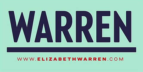
While Hickenlooper's branding is my favorite so far, his competitors are also experimenting with how to make colors other than red, white, and blue meaningful to their campaigns. The women in the race, in particular, have made the boldest visual leaps to set themselves apart. Sen. Elizabeth Warren (Mass.), for example, is using a delightful shade of mint that her campaign has named "liberty green," which puts both her environmentalism front-and-center and also pays homage to one of our country's most recognizable oxidized immigration symbols.
A free daily email with the biggest news stories of the day – and the best features from TheWeek.com
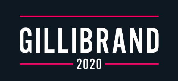
Sen. Kirsten Gillibrand (N.Y.) is using hot pink accents in her campaign, visually mirroring the bolt of feminism through her policy stances, from her advocacy for the women of #MeToo to her support of the similarly-colored Planned Parenthood. The messaging matches Gillibrand's personal brand as well, which pulls from her experiences as an American mother. Longshot candidate and Oprah's spiritual adviser Marianne Williamson uses the softer "Baker-Miller" pink in her messaging, a calming shade associated, appropriately, with reducing hostility (and attracting Millennials).
Sen. Kamala Harris (Calif.) went for a vintage look with her yellow and red, but in addition to its eye-grabbing optimism, the color has a duel historic purpose in being a tribute to the 1972 presidential campaign of Shirley Chisholm, the first black major-party candidate to run for president. But there is a danger to playing too much with associations: As the conservative website The Bulwark argues, the vintage yellow is a misstep because "you remind people of the 1970s and what an unholy mess that decade was."
Two Democrats went as far as to use gradients in their logos. While the fading colors represent a rather obvious message of transformation, neither experiment is quite successful. Hawaii Rep. Tulsi Gabbard's logo uses warm reds and yellows that blend into deep blue, an almost-too-literal riff on President Barack Obama's famous rising sun. Washington Gov. Jay Inslee's green gradient is intended to remind viewers of his climate change platform — it vaguely looks like a rotating Earth, or perhaps one changing from lush to barren gray. Unfortunately, it also manages to look like the design for a 1980s cable news network.
But even these failed experiments move away from the traditional red, white, and blue. Of almost more curiosity, then, are the Democratic candidates who decided to stick with the traditional patriotic tri-colors: Cory Booker, John Delaney, Andrew Yang (whose logo includes a literal swooping flag), and Bernie Sanders, who's stuck with his recognizable 2016 imagery. In comparison to the leaps taken by most of the 2020 Democrats, these designs feel instantly dated, like the candidates themselves missed an important memo about the kinds of people they ought to be appealing to.
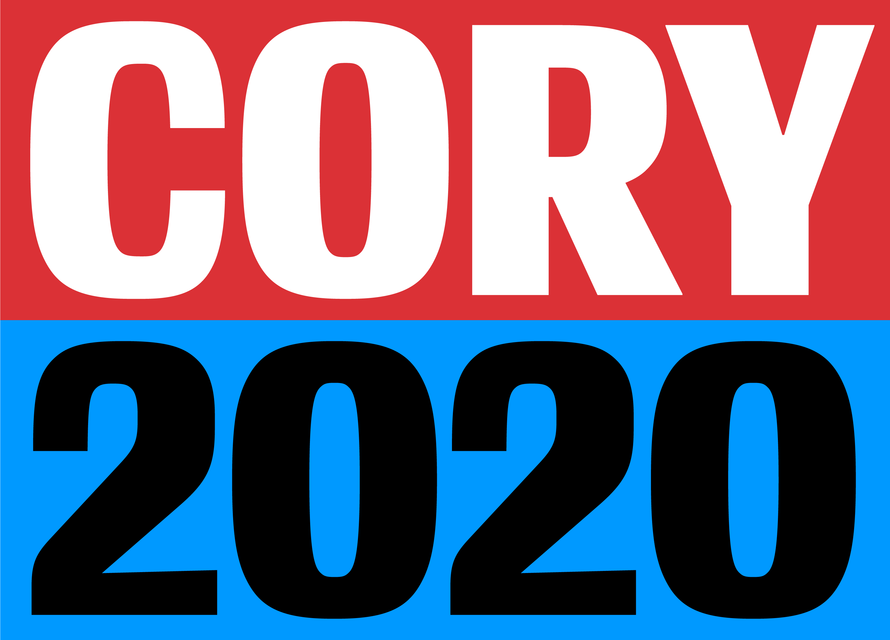


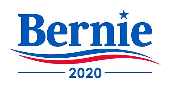
Americans — and their representatives — are more diverse than ever before, and increasingly that is a value isn't always so neatly summed up with the ol' stars and bars. As trivial as it might seem, sometimes a purple mountain is more than just a purple mountain; it's an offer of a new way to see the country, and ourselves.
Jeva Lange was the executive editor at TheWeek.com. She formerly served as The Week's deputy editor and culture critic. She is also a contributor to Screen Slate, and her writing has appeared in The New York Daily News, The Awl, Vice, and Gothamist, among other publications. Jeva lives in New York City. Follow her on Twitter.
