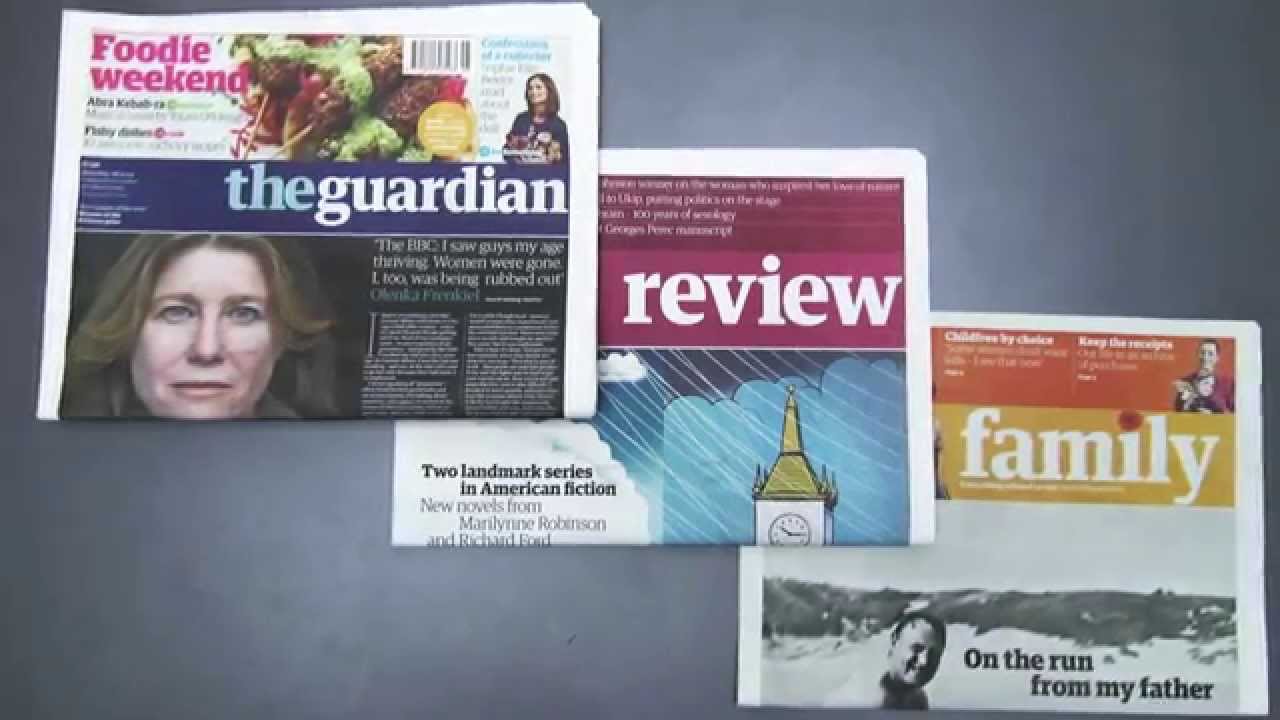
Colour has a much stronger effect on your perception than you realise - but magazine and newspaper designers certainly understand how to take advantage. Here, creative director Ash Gibson gives his insights on how colour is used in print, based on many years working across some of the UK's leading brands.
For more advice on transforming your business, visit HP BusinessNow
The Week
Escape your echo chamber. Get the facts behind the news, plus analysis from multiple perspectives.

Sign up for The Week's Free Newsletters
Join more than 350,000 subscribers and keep yourself informed with a selection of The Week’s most interesting, enlightening and entertaining stories - plus daily puzzles.
Join more than 350,000 subscribers and keep yourself informed with a selection of The Week’s most interesting, enlightening and entertaining stories - plus daily puzzles.
-
 Magazine printables - Oct. 23, 2026
Puzzles and Quizzes Magazine printables - Oct. 23, 2026
-
 The Week contest: Smile protest
Puzzles and Quizzes
-
 The UN warns about ‘mind-reading’ technology
In the Spotlight Neurotechnology creates ‘profound human rights challenges,’ the United Nation’s secretary-general said


-
 Tokenmaxxing: the AI workplace trend pushing rapid integration
The Explainer Companies are gamifying AI utilization and spending thousands in tokens weekly
-
 The executive style guide
feature Want to stand out from the business crowd? Here's all the kit you need.
-
 Seven ways to reduce stress in your office
feature You can’t completely remove it from your life, but there are some easy ways to relieve it…
-
 Hello Fresh: The transformation begins
feature New offices and a wealth of new IT from HP for Hello Fresh.
-
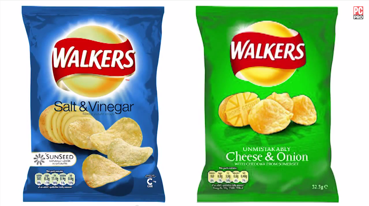 Controversial Colour Branding Decisions
feature Scott King and Russell Jones from Condiment Junkie discuss how some brands have decided to swim against the tide with their colour choices.
-
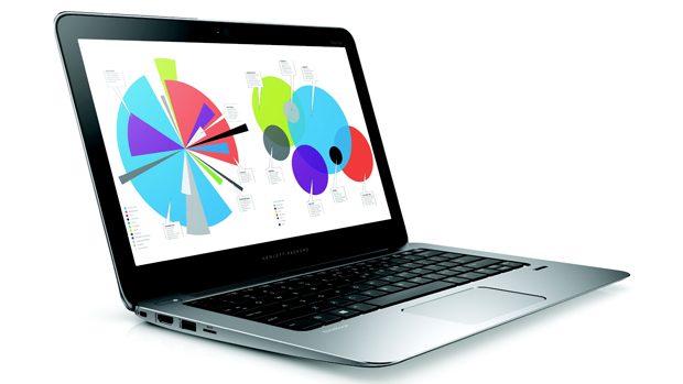 How do you design a computer?
feature Lead designer of HP, Chad Paris, explains how new computers are brought to life
-
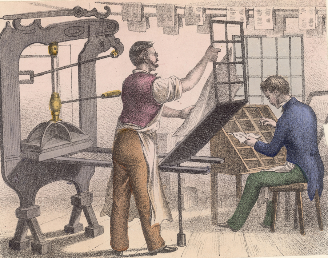 The story of print
feature Printing has come a long way since its origins. Here we map out the story of print past, present and future
-
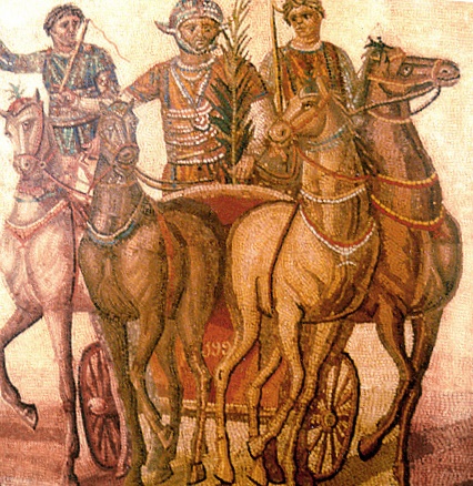 Tribal Colours
feature Colour has been used for centuries as a means to communicate where we belong, finds Stuart Andrews