The White House's chart of troop levels is wildly misleading

The White House's chart of troop levels is wildly misleading

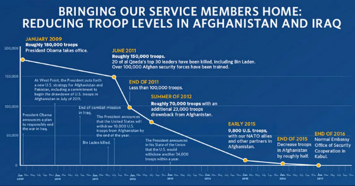
Earlier this week, the White House released this chart of troop levels in Afghanistan and Iraq during the Obama administration:

Combining the two is strange, isn't it? Consider what happens when you break out Afghanistan alone, as Reuters did awhile back:

That's telling, especially given that the Afghan troop increase was a cornerstone of President Obama's foreign policy back in 2009. Seems like a tacit admission that the surge was not, in fact, a very good idea.

Subscribe to The Week

Escape your echo chamber. Get the facts behind the news, plus analysis from multiple perspectives.

SUBSCRIBE & SAVE
https://cdn.mos.cms.futurecdn.net/flexiimages/jacafc5zvs1692883516.jpg

Sign up for The Week's Free Newsletters

From our morning news briefing to a weekly Good News Newsletter, get the best of The Week delivered directly to your inbox.

From our morning news briefing to a weekly Good News Newsletter, get the best of The Week delivered directly to your inbox.

Sign up
Explore More
Ryan Cooper

Ryan Cooper is a national correspondent at TheWeek.com. His work has appeared in the Washington Monthly, The New Republic, and the Washington Post.