Here's what the iOS 7 overhaul will (probably) look like
Jony Ive's re-imagining seems to be very colorful, and quite svelte

Apple's Worldwide Developers Conference is set to kick off this afternoon. (You can stream it live here, but you'll need Safari 4.0 or later. Thanks, Apple.) But 9to5 Mac seems to have gotten an early peak at lead designer Jony Ive's first crack at iOS 7, which is supposed to eschew realistic design elements — the green poker table felt in the Game Center, for example — in favor of so-called "flat design."
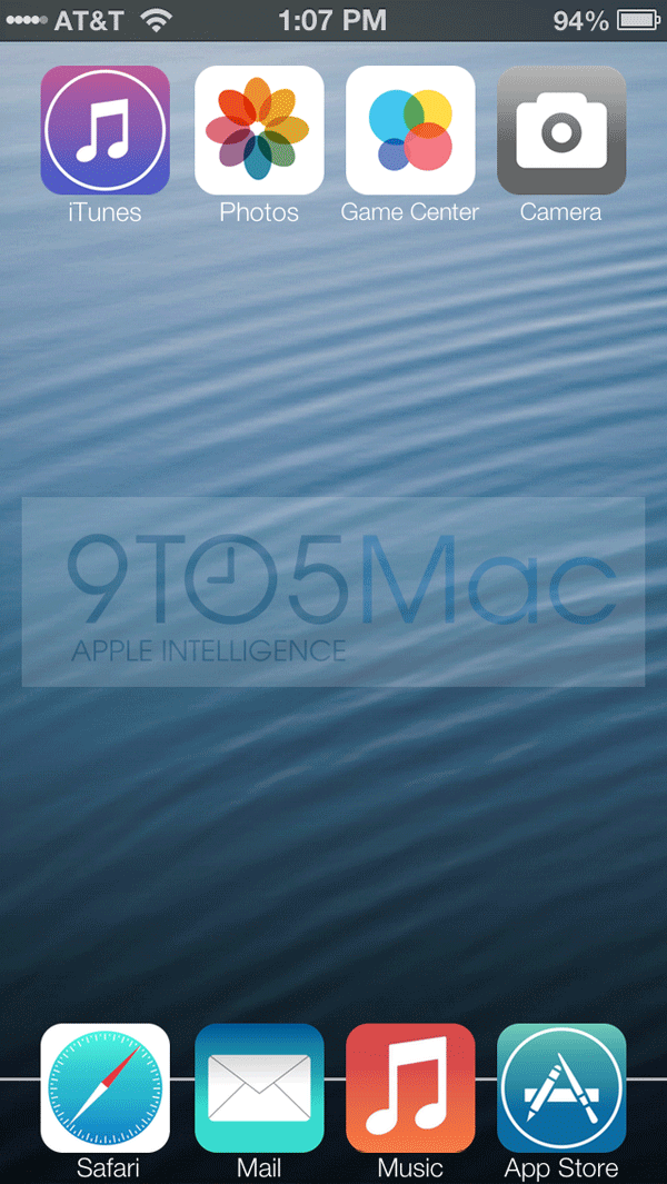
9to5 Mac has a full mock-up of what the app icons will supposedly look like. It's still a far cry from, say, Windows 8's tile-based UI, but the aesthetic changes are still the most significant we've seen to iOS since the mobile platform debuted in 2007. Here's a quick rundown:
• Expect a slimdown. iOS 7's primary system font will be a Helvetica offshoot called Helvetic Neue Ultra Light, which, as its name suggests, is more svelte than its predecessor. Devin Coldeway at NBC News says it's like "Apple's interfaces are going on a diet."
The Week
Escape your echo chamber. Get the facts behind the news, plus analysis from multiple perspectives.

Sign up for The Week's Free Newsletters
From our morning news briefing to a weekly Good News Newsletter, get the best of The Week delivered directly to your inbox.
From our morning news briefing to a weekly Good News Newsletter, get the best of The Week delivered directly to your inbox.
• 9to5 Mac reports that instead of carrier signal bars, there will be 5 dots that are white or grey to indicate connection strength.
• The app icons themselves are redesigned to look "flatter" and with less sheen. iOS 7's color palette, which was hinted at in the WWDC logo sent out to the press, is warmer than the color combinations we're used to.

(Via 9to5 Mac)
• The notifications in the drop-down menu might have horizontal scrolling.
A free daily email with the biggest news stories of the day – and the best features from TheWeek.com
• Apple's native apps will run two different color schemes when you open them: One will be white-themed, the other black-themed. (Instead of Notes' yellow legal notepad, for example, expect something more functional — like a white background with dark text.) Though as Jamie Condliffe at Gizmodo points out, the two-tone rumor could be a decoy.
Head over to 9to5 Mac to see more iOS 7 mock-ups. The changes look nice, but there are far more pressing complaints plaguing iOS in terms of usability: The keyboard still stinks, for example. Copy+paste is still a chore. You can't change your default mail/browser/mapping apps. We'll see if Apple addresses these annoyances later today, beginning at 1 p.m. EST.
