‘Very Peri’: how to use 2022’s colour of the year in your home and garden
Designers and stylists share their top tips for Pantone’s new blue hue
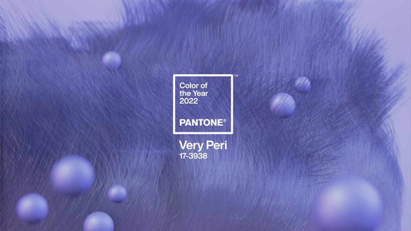
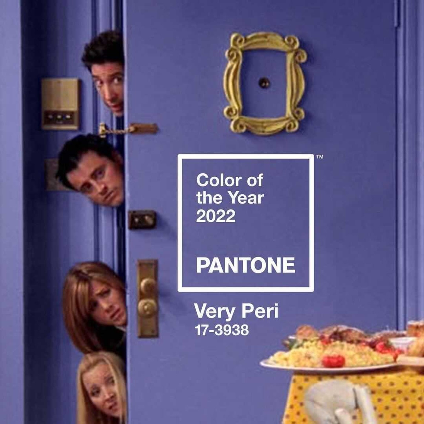
Pantone has created a brand new shade of blue – “Very Peri” – which has been selected as its colour of the year for 2022.
Officially called “Pantone 17-3938 Very Peri”, it is described as a “dynamic periwinkle blue hue with a vivifying violet red undertone”, the institute said. Blending the “faithfulness and constancy” of blue with the “energy and excitement” of red, this “happiest and warmest of all the blue hues introduces an empowering mix of newness”.
Creating a new colour for the first time in the 22-year history of the colour of the year reflects the “global innovation and transformation taking place”, said Laurie Pressman, vice president of the Pantone Color Institute. And the choice of Very Peri was “largely influenced by the desire to overcome the Covid-19 pandemic, environmental concerns and a larger reckoning with injustice and flaws within our current social structures”, Time reported.
The Week
Escape your echo chamber. Get the facts behind the news, plus analysis from multiple perspectives.

Sign up for The Week's Free Newsletters
From our morning news briefing to a weekly Good News Newsletter, get the best of The Week delivered directly to your inbox.
From our morning news briefing to a weekly Good News Newsletter, get the best of The Week delivered directly to your inbox.

When used in home décor and interior design, Very Peri injects a sense of “playful freshness into home interiors, enlivening a space through unusual colour combinations”, Pantone said. This versatile shade is suited to an array of different materials, textures and finishes, providing “a pop of colour, whether introduced through a painted wall, accent furniture or home décor, or acting as an intriguing and eye-catching accent in a pattern”.
Here, designers and stylists share their top tips for using Very Peri in your home and garden…
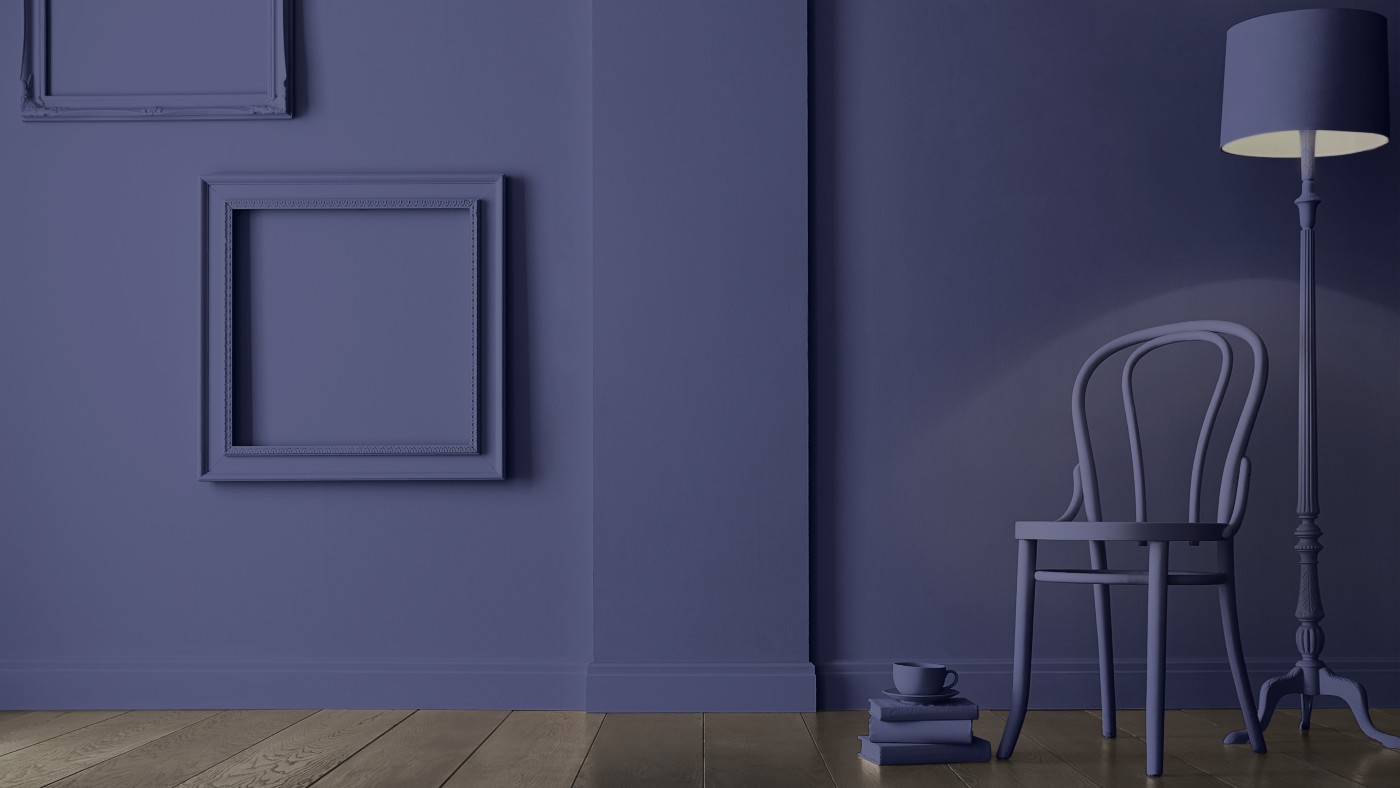
Pantone’s colour of the year may seem like a “brave choice” for paint if you’re a “little nervous of redecorating and have usually remained a steadfast neutral person”, said Paula Taylor, trend specialist at wallpaper, paint and home interior specialists Graham & Brown. However, Very Peri “reflects the transition from digital to reality” that “many of us are currently experiencing in our homes”.
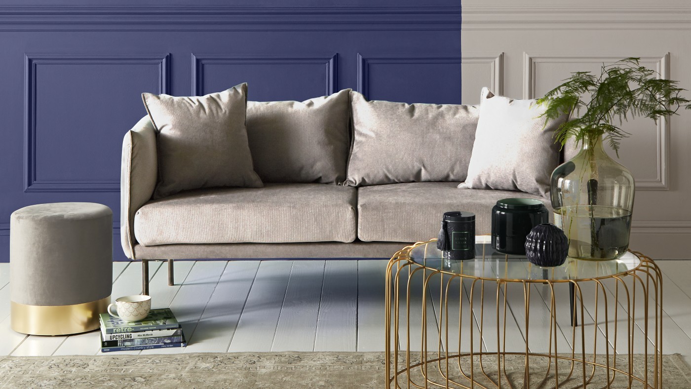
Working from home digitally, to home life in reality, our “surroundings can reflect the blurred boundaries between the two”, Taylor said. Last year Graham & Brown predicted Tanzanite to be a “big player on the paint scene – a bold splash creating that vibrancy that we are so in need of in our homes”. It will add a welcoming backdrop to any hallway and in a bedroom it will provide a “fabulous pop to compliment the pared back, calming neutral greens that we have all been using”. For a crisp comforting living room, you can team this with soft off whites, like Baked Cheesecake, to create a “timeless effect with a modern twist”.
A free daily email with the biggest news stories of the day – and the best features from TheWeek.com
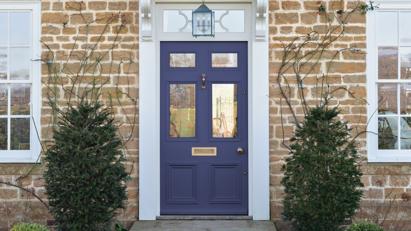
“We aren’t afraid of colour and love the bold announcement of ‘Very Peri’ as Pantone’s colour of the year,” said James Greenwood, Graham & Brown brand and interiors expert. This look is easily translatable into home décor schemes and the Tanzanite paint is the perfect combination of a striking blue with red undertones. This royal colour looks purple in brighter lighting, or deeper blue in dimmer closed spaces.
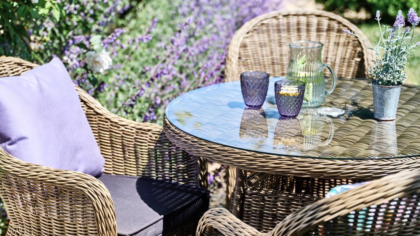
Luxury home and garden furniture supplier Bridgman has put together some top tips on how to use the colour of the year to invigorate gardens in 2022. Very Peri is a “spritely, joyous and dynamic” colour that “encourages courageous creativity and imaginative expressions”, the company said. “So don’t be afraid to be bold with this beautiful violet-blue shade.” Liven up neutral furniture by introducing dynamic periwinkle accessories. The mild olive-green rattan weave of the Mayfair Collection pairs perfectly with lavender scatter cushions. These versatile cushions are completely waterproof and effortlessly elegant, providing excellent practicality and a luxurious look.
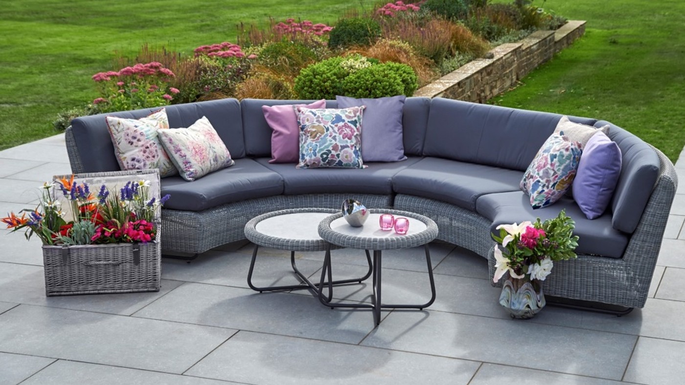
Grey tones also make for a “harmonious complement” to periwinkle, Bridgman said. Cliveden Collection lounging and dining furniture is characterised by stunning handwoven grey rattan and matching grey waterproof cushions that complement each chair. Accessorise furniture from this collection with Very Peri-inspired pieces to create a serene and calming outdoor space where you can relax and unwind.
