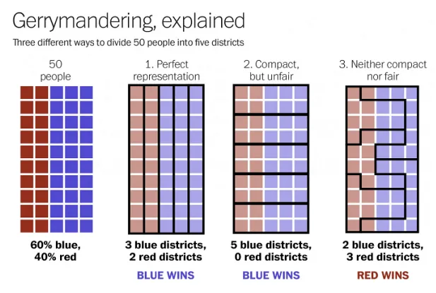
How gerrymandering works, in one graphic
A free daily email with the biggest news stories of the day – and the best features from TheWeek.com
You are now subscribed
Your newsletter sign-up was successful
Via The Washington Post and Reddit comes a handy little graphic that succinctly visualizes how gerrymandering — when political districts are unfairly mapped to manipulate elections — can have such a significant impact:
Of course, in real life, gerrymandered districts often look far more convoluted than the simplified ones in option three. For a look at some of the most ridiculous districts in the country — "crimes against geography" — click here.
Article continues belowThe Week
Escape your echo chamber. Get the facts behind the news, plus analysis from multiple perspectives.
Sign up for The Week's Free Newsletters
From our morning news briefing to a weekly Good News Newsletter, get the best of The Week delivered directly to your inbox.
A free daily email with the biggest news stories of the day – and the best features from TheWeek.com
Bonnie Kristian was a deputy editor and acting editor-in-chief of TheWeek.com. She is a columnist at Christianity Today and author of Untrustworthy: The Knowledge Crisis Breaking Our Brains, Polluting Our Politics, and Corrupting Christian Community (forthcoming 2022) and A Flexible Faith: Rethinking What It Means to Follow Jesus Today (2018). Her writing has also appeared at Time Magazine, CNN, USA Today, Newsweek, the Los Angeles Times, and The American Conservative, among other outlets.
