Why you should never use Times New Roman on a résumé: Typography geeks explain


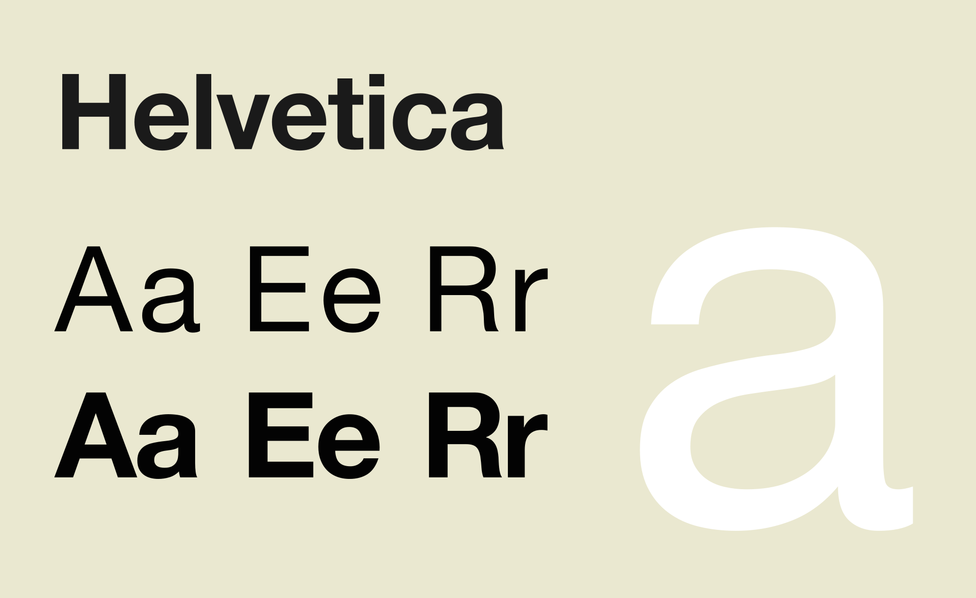
There are an endless supply of articles about what to include in your résumé and what to leave out — in fact, there are whole books dedicated to the subject. But what about the font you use to put your professional life to paper? Bloomberg's Natalie Kitroeff spoke with "three typography wonks" to get their opinion, and they had a consensus choice: Helvetica (the font so classy it has an entire documentary dedicated to its sans-serif glory).
Helvetica is safe, and it "feels professional, lighthearted, honest," designer Brian Hoff tells Bloomberg. If you want to stand out a bit, you can drop $30 (up to $734) to buy the font Proxima Nova, and if you insist on using serifs (the feet that adorn letters), go with Garamond or maybe Didot, the typography geeks suggest. Do not use Times New Roman.
"It's telegraphing that you didn't put any thought into the typeface that you selected," Hoff says. "It's like putting on sweatpants." For other suggestions and the font cognoscenti view on emojis (maybe!), read Kitroeff's dispatch at Bloomberg.
Subscribe to The Week
Escape your echo chamber. Get the facts behind the news, plus analysis from multiple perspectives.

Sign up for The Week's Free Newsletters
From our morning news briefing to a weekly Good News Newsletter, get the best of The Week delivered directly to your inbox.
From our morning news briefing to a weekly Good News Newsletter, get the best of The Week delivered directly to your inbox.
Sign up for Today's Best Articles in your inbox
A free daily email with the biggest news stories of the day – and the best features from TheWeek.com
Peter has worked as a news and culture writer and editor at The Week since the site's launch in 2008. He covers politics, world affairs, religion and cultural currents. His journalism career began as a copy editor at a financial newswire and has included editorial positions at The New York Times Magazine, Facts on File, and Oregon State University.
-
 The Y chromosome degrades over time and men's health is paying for it
Under the radar The chromosome loss is linked to cancer and Alzheimer's
-
 One great cookbook: 'I Dream of Dinner (so you don't have to)'
the week recommends The endless ease and versatility of a painless dinner
-
 Sudoku medium: May 7, 2025
The Week's daily medium sudoku puzzle
-
 Warren Buffet announces surprise retirement
speed read At the annual meeting of Berkshire Hathaway, the billionaire investor named Vice Chairman Greg Abel his replacement
-
 Trump calls Amazon's Bezos over tariff display
Speed Read The president was not happy with reports that Amazon would list the added cost from tariffs alongside product prices
-
 Markets notch worst quarter in years as new tariffs loom
Speed Read The S&P 500 is on track for its worst month since 2022 as investors brace for Trump's tariffs
-
 Tesla Cybertrucks recalled over dislodging panels
Speed Read Almost every Cybertruck in the US has been recalled over a stainless steel panel that could fall off
-
 Crafting emporium Joann is going out of business
Speed Read The 82-year-old fabric and crafts store will be closing all 800 of its stores
-
 Trump's China tariffs start after Canada, Mexico pauses
Speed Read The president paused his tariffs on America's closest neighbors after speaking to their leaders, but his import tax on Chinese goods has taken effect
-
 Chinese AI chatbot's rise slams US tech stocks
Speed Read The sudden popularity of a new AI chatbot from Chinese startup DeepSeek has sent U.S. tech stocks tumbling
-
 US port strike averted with tentative labor deal
Speed Read The strike could have shut down major ports from Texas to Maine