Fox News chart conveniently distorts ObamaCare enrollments
Screenshot
(Image credit: Screenshot)
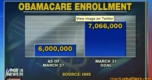
Numbers don't lie... unless you twist them woefully out of context. Case in point: Fox News' America's Newsroom on Monday displayed the following chart, flagged by the folks over at Media Matters, that appeared to show ObamaCare failing miserably at its goal of attracting 7 million enrollees:
The Week
Escape your echo chamber. Get the facts behind the news, plus analysis from multiple perspectives.
SUBSCRIBE & SAVE

Sign up for The Week's Free Newsletters
From our morning news briefing to a weekly Good News Newsletter, get the best of The Week delivered directly to your inbox.
From our morning news briefing to a weekly Good News Newsletter, get the best of The Week delivered directly to your inbox.

Explore More
