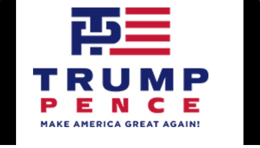
The Trump-Pence logo was an extremely bad idea


Designing a good logo is really hard — just ask Airbnb. But for some reason or another, the 2016 presidential race seems to have its share of exceptionally bad logos, including Hillary Clinton's giant red arrow pointing to the right and Jeb Bush's definitely-not-low-energy exclamation point.
But the newly-revealed Trump-Pence fundraising logo spectacularly takes the cake:
Nobody knows what's going on with it. Or, well, actually everyone does know what's going on with it, but they're too polite to say:
The Week
Escape your echo chamber. Get the facts behind the news, plus analysis from multiple perspectives.

Sign up for The Week's Free Newsletters
From our morning news briefing to a weekly Good News Newsletter, get the best of The Week delivered directly to your inbox.
From our morning news briefing to a weekly Good News Newsletter, get the best of The Week delivered directly to your inbox.
Okay, come on folks, get your mind out of the gutter. Jeva Lange
A free daily email with the biggest news stories of the day – and the best features from TheWeek.com
Jeva Lange was the executive editor at TheWeek.com. She formerly served as The Week's deputy editor and culture critic. She is also a contributor to Screen Slate, and her writing has appeared in The New York Daily News, The Awl, Vice, and Gothamist, among other publications. Jeva lives in New York City. Follow her on Twitter.

