Someone made a font out of gerrymandered congressional districts
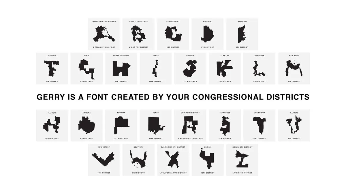
Congressional districts have a reputation for being downright ridiculous.
North Carolina's 12th district resembled a severely broken snake until it was revamped in 2017. Pretty much all of Maryland's districts defy comparison to anything but abstract art. And then there are a few dozen districts that look like letters in the alphabet — so much so that an anonymous gerrymandering fighter turned them into a font.
The Week
Escape your echo chamber. Get the facts behind the news, plus analysis from multiple perspectives.

Sign up for The Week's Free Newsletters
From our morning news briefing to a weekly Good News Newsletter, get the best of The Week delivered directly to your inbox.
From our morning news briefing to a weekly Good News Newsletter, get the best of The Week delivered directly to your inbox.

