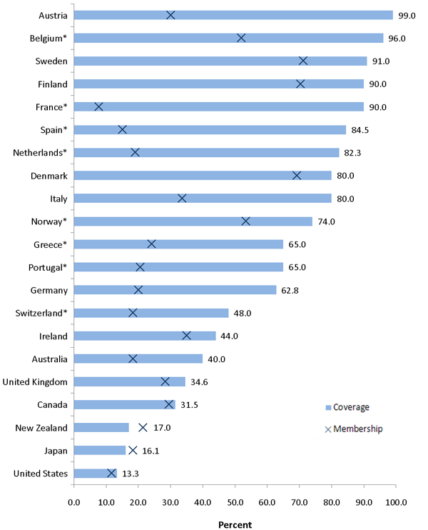
Union density across the world, in one eye-popping chart
MARIO TAMA/Getty Images


Responding to Evan Soltas on union density, Matt Bruenig gives us the following amazing chart (which comes in turn from the CEPR) over at Demos:

Wow, Austria! In this chart, the X's represent union membership, while the blue bars represent coverage — people who are covered by a union contract. Bruenig comments:
This is just one example, but it gets at the core of the problem with Soltas' approach here. He endeavored to answer the union question with wonk-economics methods...[But] as best as I can tell, all of these countries are on the globe, yet somehow the fundamental economic forces of globalization and technology have affected them in very different ways. Again, this points to the dominant role a country's political economy plays in how its labor market institutions are structured. [Demos]
Though one does wonder how Japan and New Zealand have coverage that is lower than membership. Shouldn't that be impossible?
The Week
Escape your echo chamber. Get the facts behind the news, plus analysis from multiple perspectives.

Sign up for The Week's Free Newsletters
From our morning news briefing to a weekly Good News Newsletter, get the best of The Week delivered directly to your inbox.
From our morning news briefing to a weekly Good News Newsletter, get the best of The Week delivered directly to your inbox.
UPDATE: On Twitter, Bruenig kindly provides the answer. Turns out that part of calculating the coverage rate includes subtracting workers who aren't allowed to engage in collective bargaining (some public sector workers, in some countries, for example). Thanks Matt!
A free daily email with the biggest news stories of the day – and the best features from TheWeek.com
Ryan Cooper is a national correspondent at TheWeek.com. His work has appeared in the Washington Monthly, The New Republic, and the Washington Post.

