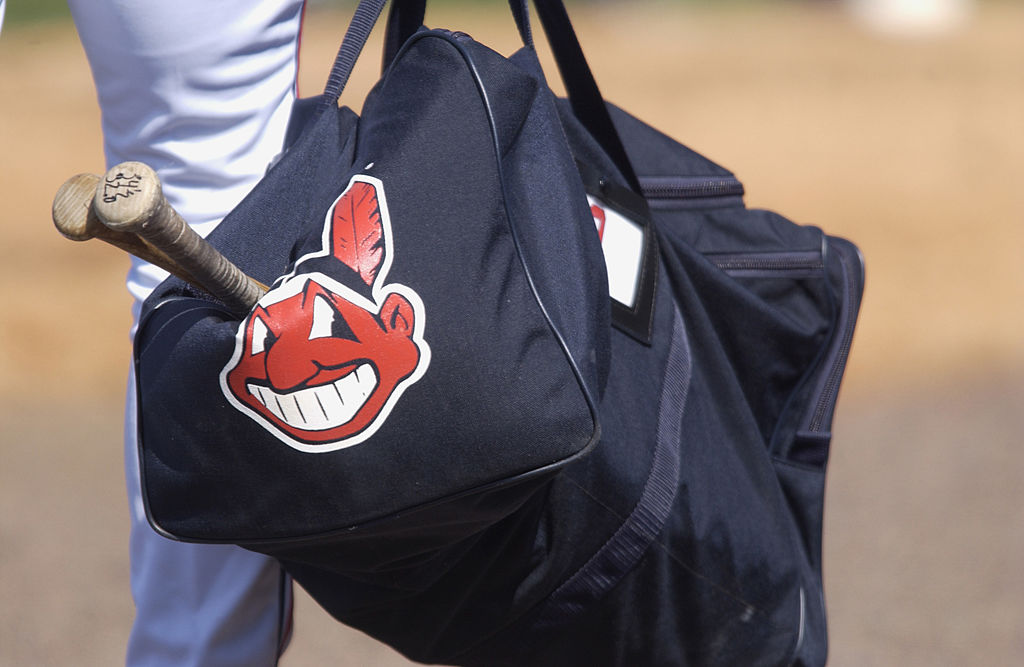
The Cleveland Indians' logo actually got progressively more racist over the years


A free daily email with the biggest news stories of the day – and the best features from TheWeek.com
You are now subscribed
Your newsletter sign-up was successful
While the Washington Redskins have long been the focal point of the sports branding racism debates, the Cleveland Indians' presence in this year's World Series has thrown their cartoon mascot, "Chief Wahoo," back into the spotlight.
What is remarkable about the Indians' branding is that it has grown worse over time, as demonstrated by a historical progression of Cleveland logos shared by Fast Company. In the team's earliest years, its logo was a simple C for Cleveland, but in 1928 the team adopted a pictorial logo. It all went downhill from there, and though the C logo was brought back in 2014, Chief Wahoo still appears in arguably his most racist form on the team's uniforms and merchandise.
The Braves, currently of Atlanta, followed a similar pattern of moving from single letter logos and more realistic depictions of their Native mascot to an increasingly cartoonish and literally red version.
Article continues belowThe Week
Escape your echo chamber. Get the facts behind the news, plus analysis from multiple perspectives.

Sign up for The Week's Free Newsletters
From our morning news briefing to a weekly Good News Newsletter, get the best of The Week delivered directly to your inbox.
From our morning news briefing to a weekly Good News Newsletter, get the best of The Week delivered directly to your inbox.
For more on Chief Wahoo in particular and Native imagery in sports more broadly, check out this analysis from The Week's Emily L. Hauser.
A free daily email with the biggest news stories of the day – and the best features from TheWeek.com
Bonnie Kristian was a deputy editor and acting editor-in-chief of TheWeek.com. She is a columnist at Christianity Today and author of Untrustworthy: The Knowledge Crisis Breaking Our Brains, Polluting Our Politics, and Corrupting Christian Community (forthcoming 2022) and A Flexible Faith: Rethinking What It Means to Follow Jesus Today (2018). Her writing has also appeared at Time Magazine, CNN, USA Today, Newsweek, the Los Angeles Times, and The American Conservative, among other outlets.
