The Premier League has unveiled a new look for next season as it prepares for life without a headline sponsor.
The competition's current deal with Barclays, worth £40m a season, finishes at the end of the season and from the next, it will "rely on alternative sponsorship elements", reports The Guardian. The new-look branding will "be at the vanguard of a new phase of positioning by the organisation", it adds.
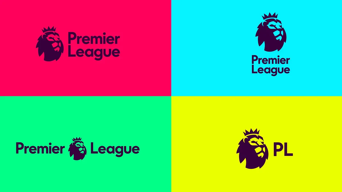
Instead of having one headline sponsor, the league will instead have "a roster of secondary rights partners", reports the Daily Mail. "Two - Nike and EA Sports - have already been announced with five more to be named in the coming months."
The Week
Escape your echo chamber. Get the facts behind the news, plus analysis from multiple perspectives.
SUBSCRIBE & SAVE
Sign up for The Week's Free Newsletters
From our morning news briefing to a weekly Good News Newsletter, get the best of The Week delivered directly to your inbox.
From our morning news briefing to a weekly Good News Newsletter, get the best of The Week delivered directly to your inbox.
Latest Videos From
Without a main sponsor, the Premier League hopes to establish itself as a brand in its own right - and was willing to reject a £45m-a-year offer from drinks brand Diageo.
"The decision to have no lead sponsor also makes it easier for the Premier League to communicate to their global audience," says the Mail. "The move reflects the organisation's desire to mirror major American sports leagues like the NBA and NFL in presenting a 'clean' brand."
It is the first change to the league's branding since 2007 and the timing is fitting, says the Guardian. The league table already has an "unfamiliar look", with Leicester and Tottenham Hotspur at the top, and the logos add "another new sheen" to the competition's changing image.
Although the crowned lion, present on the crest since the Premier League was formed in 1992, remains central to the design, the badge "marks a considerable departure from the current emblem", claims the Guardian.
The logos, from agency DesignStudio, feature only the head of the lion. The Mail describes it as a "fresh new design [that] includes a modern take on the lion icon" but not everyone agrees. The Daily Telegraph claims "it looks very similar to the old visual identity", while, unsurprisingly, there was widespread mockery on Twitter.